BrewHaus
A coffee brand built around one bean
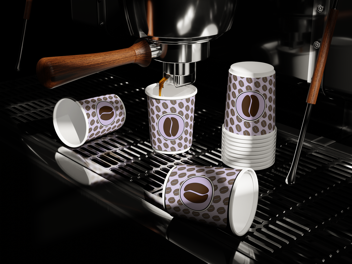
BrewHaus is a branding and packaging project for a modern coffee brand. Thrive designed the identity from concept to execution: a wordmark with a coffee bean for the A, a lavender-and-espresso palette, a bean pattern, and the bags, cups, menu and sign that carry it.
Overview
BrewHaus is a coffee brand that balances bold personality with craft culture. The identity had to feel warm, expressive and easy to recognize on a shelf, on a cup and on a phone screen.
Thrive took it from the first logo through the color system, packaging layouts and mockups, so every piece reads as the same brand.
Roasts with their own bag: Night Shift and Morning Muse
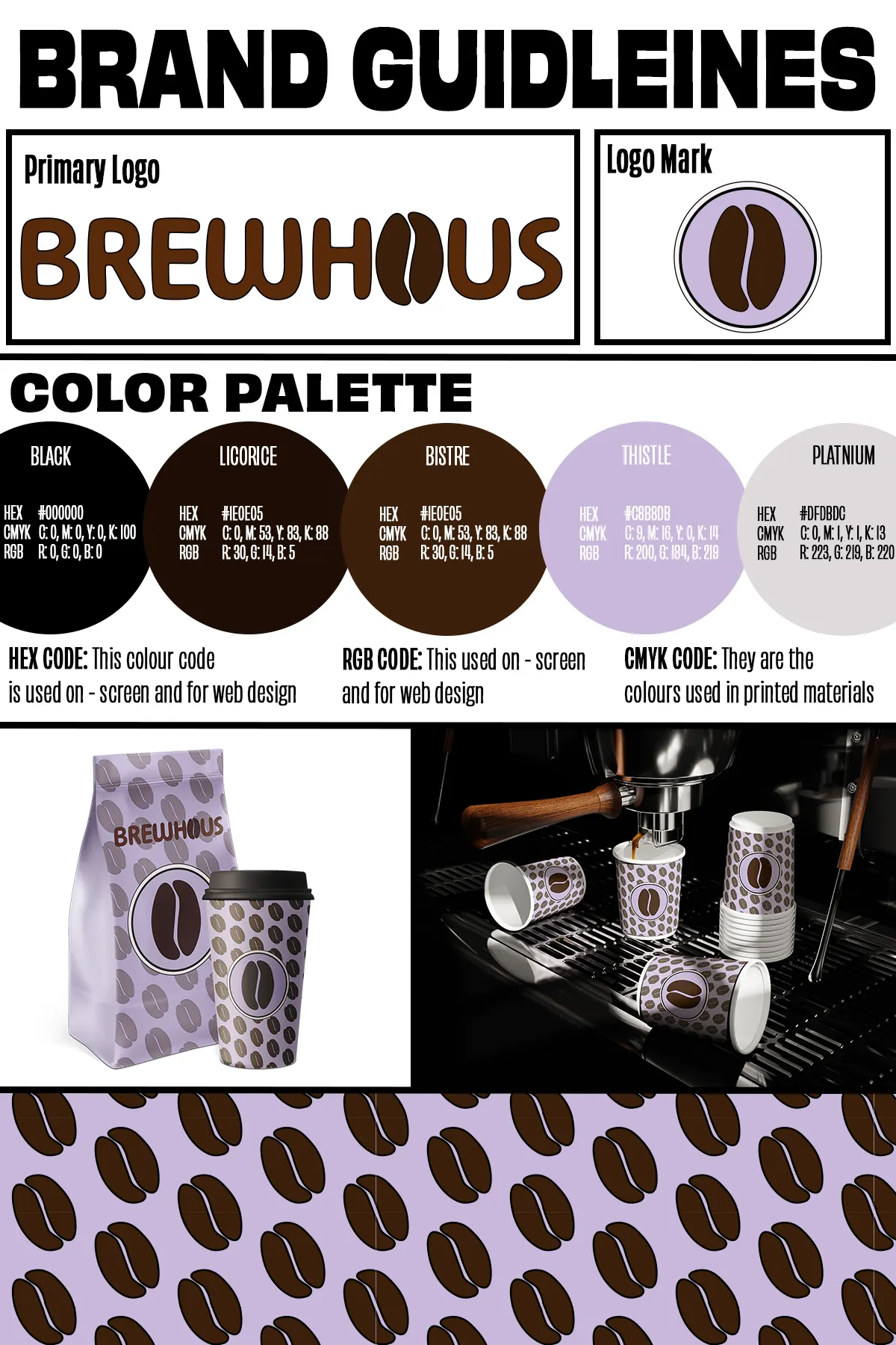
Colors in the brand guidelines
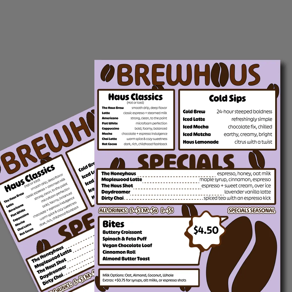
Menu sections: Haus Classics, Cold Sips, Specials, Bites
The challenge
BrewHaus needed a look with shelf impact that also works in short-form content, and still says “coffee” at a glance.
Be recognizable fast
One simple symbol that works as a logo, a pattern and a cup stamp.
Bold type and color
A clear hierarchy so the brand name, roast name and flavor notes read in that order.
Room for more coffees
A packaging system that new roasts can slot into without a redesign.
The approach
- 01
Logo and mark
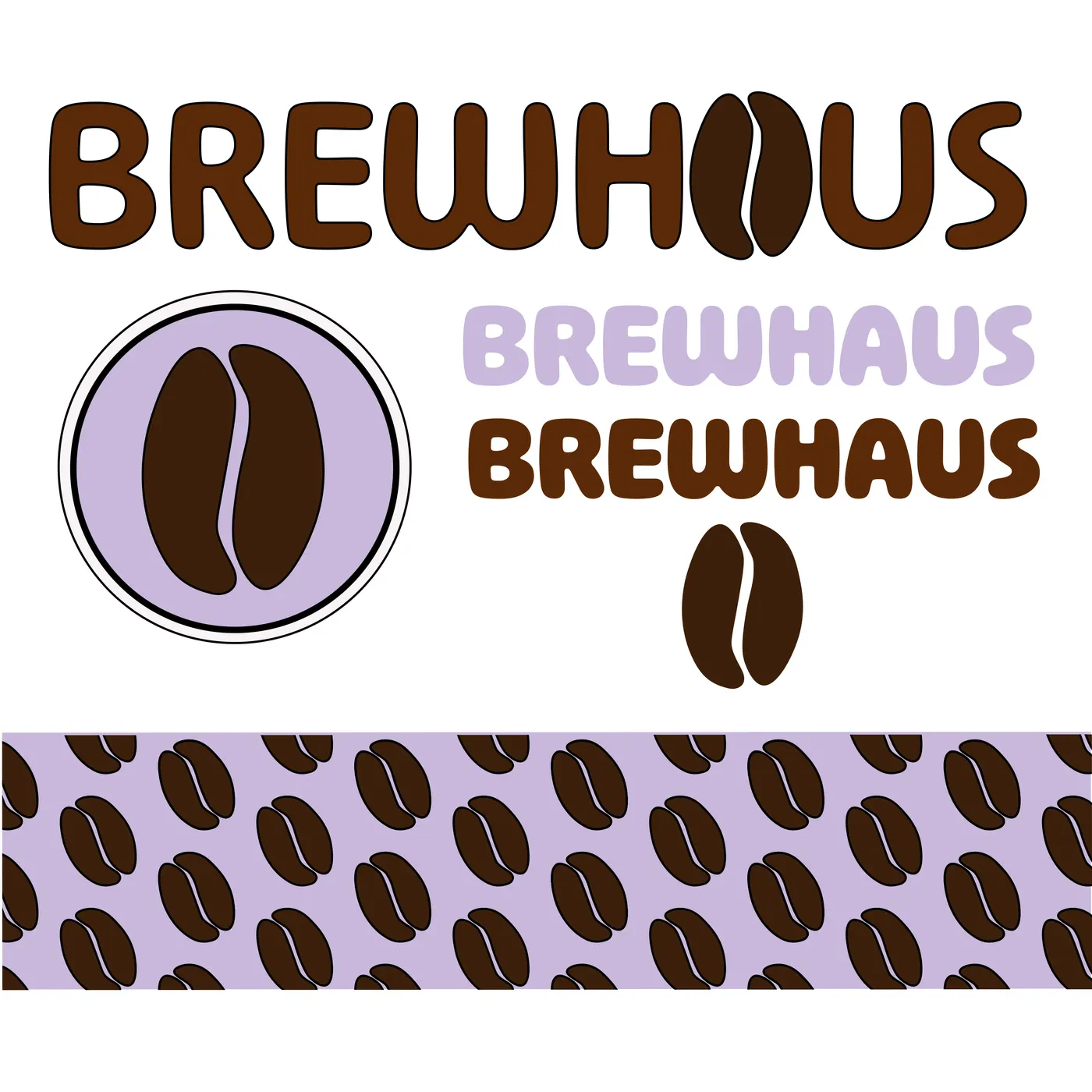
A rounded, heavy wordmark with a two-tone coffee bean standing in for the A. The bean also works alone, set in a lavender circle as the logo mark.
- 02
Color and pattern
Espresso browns, lavender (Thistle) and a soft gray, documented with HEX, RGB and CMYK values. A repeating pattern of tilted beans turns the mark into a surface.
- 03
Packaging
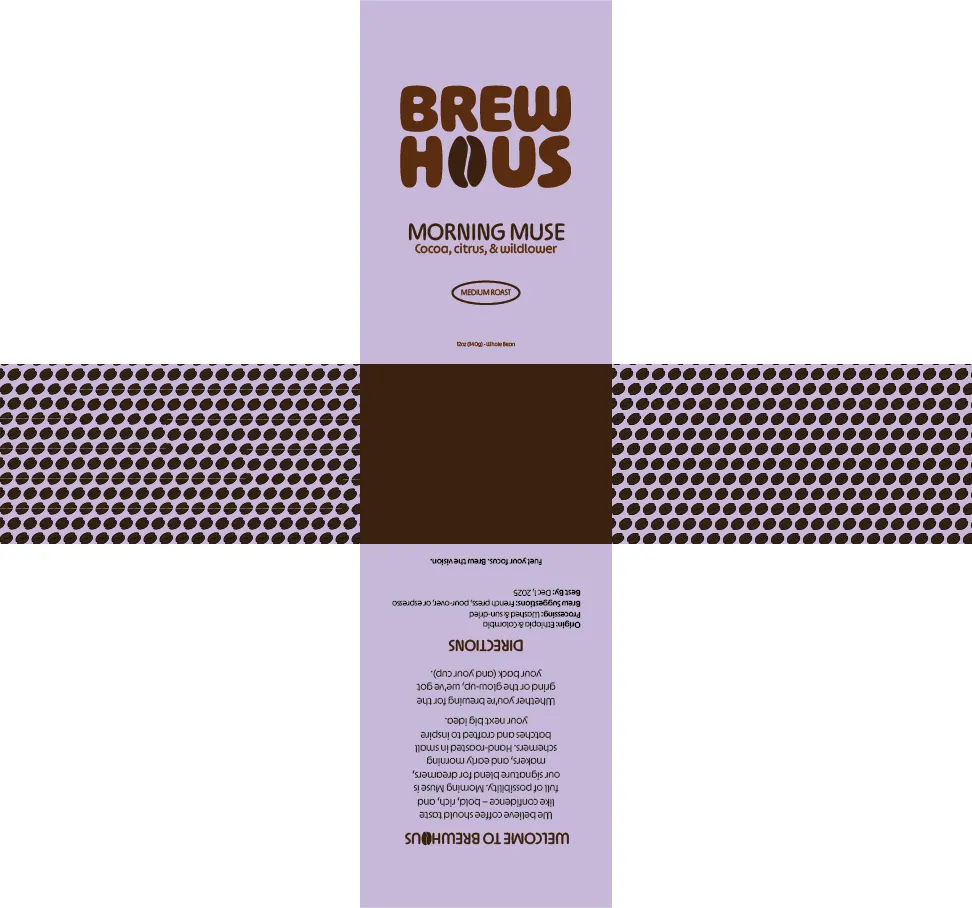
Full bag dielines with the logo, roast name and flavor notes on the front, the bean pattern on the gussets, and the story, origin and brewing directions on the back.
- 04
Applications and mockups
Paper cups, to-go cups, a café menu and a storefront sign, mocked up to show the system working in the real world.
The work
Logo
The primary wordmark, the bean logo mark, one-color versions of the name and the bean pattern.
Packaging
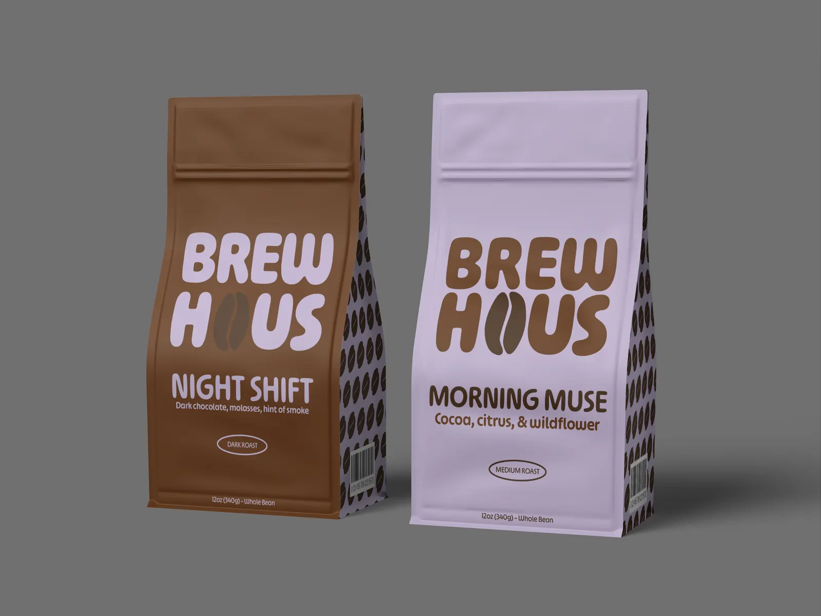
Each roast gets its own color: Night Shift (dark chocolate, molasses, hint of smoke) on brown, Morning Muse (cocoa, citrus and wildflower) on lavender. Both are 12 oz whole-bean bags. The back panel tells the BrewHaus story and lists origin, processing and brew suggestions, signed off with “Fuel your focus. Brew the vision.”
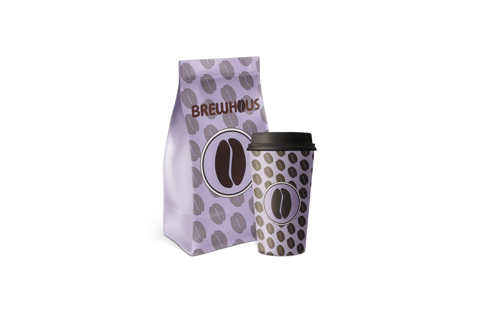
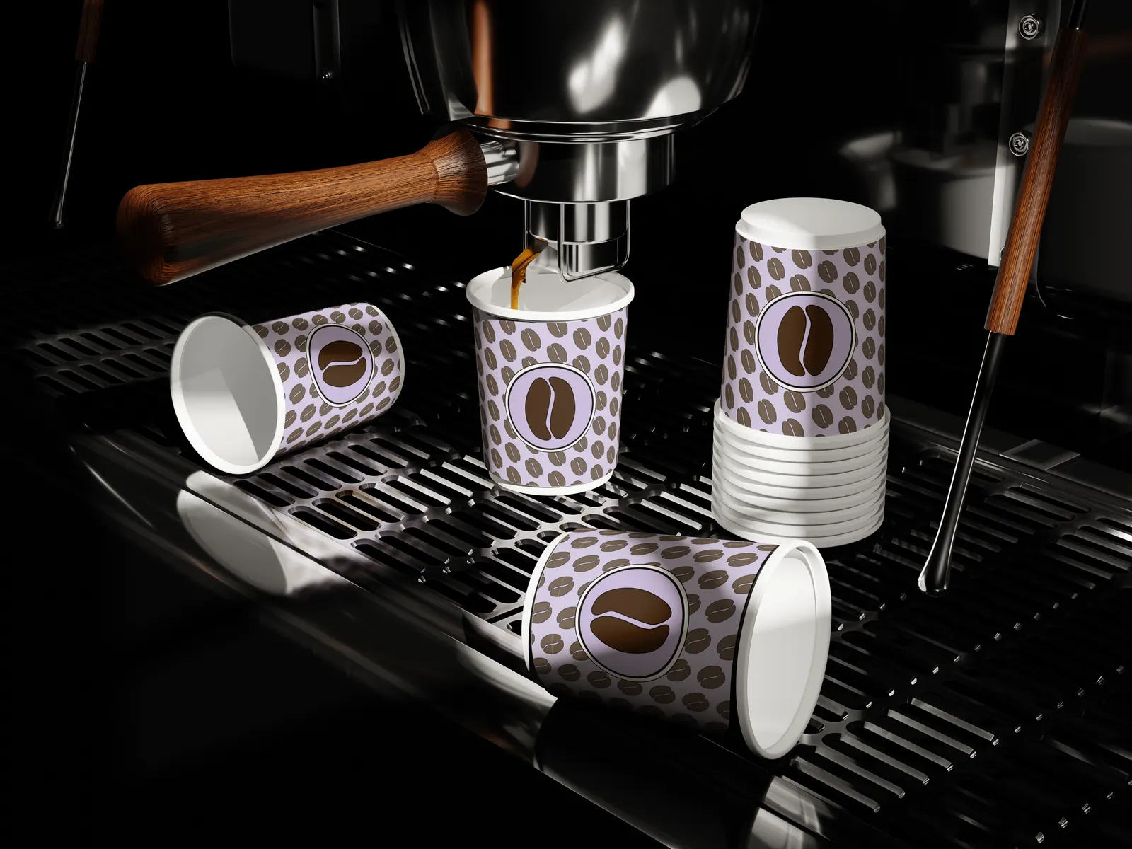
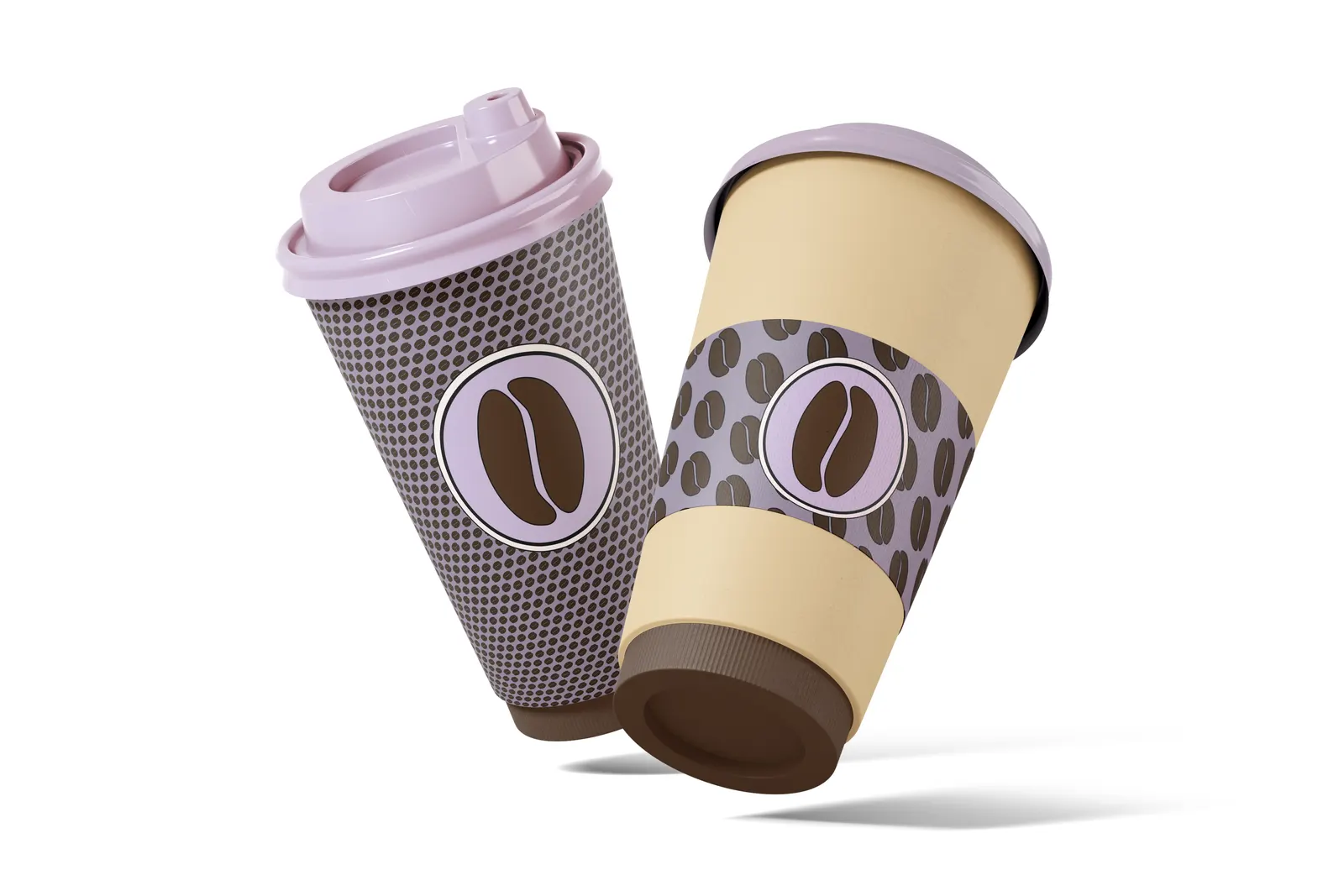
Cups
The logo mark sits in a circle on every cup, with the bean pattern or a fine dot pattern around it.
Menu and signage
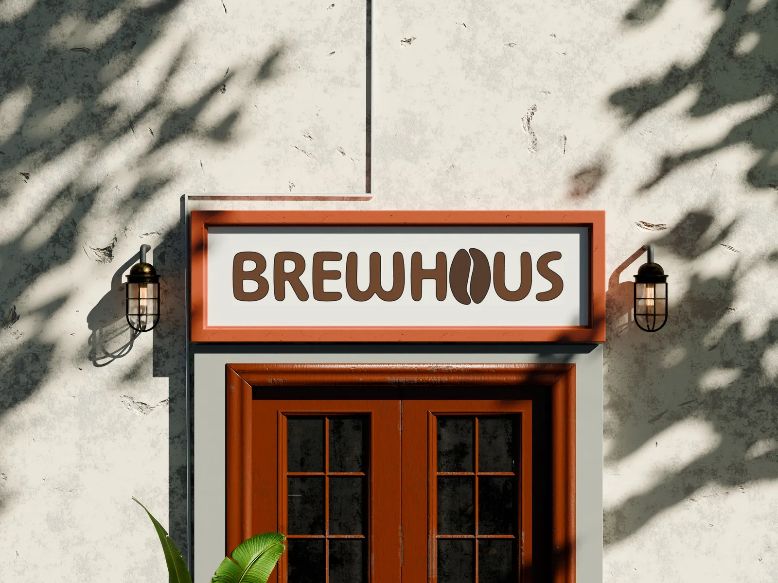
A lavender menu in the brand's bold type: Haus Classics, Cold Sips, house Specials like the Honeyhaus and Maplewood Latte, and Bites. Out front, the wordmark goes on a sign above the door.
Design system
Rich espresso browns against a soft lavender. The lavender makes the brand easy to spot; the browns keep it about coffee.
#5A2A0A#3B1F0B#1E0E05#C8B8DB#DFDBDC#000000Type
A heavy, rounded sans-serif for the wordmark and roast names gives the brand a friendly, confident voice. Flavor notes and menu items sit underneath in a lighter weight.
The bean as the A
The coffee bean replaces a letter in the name, so the logo says what BrewHaus sells without a tagline.
Bean pattern
Tilted beans repeat across bag gussets, cups and sleeves, so even a corner of the packaging is recognizable.
One color per roast
Brown for the dark roast, lavender for the medium roast. The layout stays the same, so new roasts only need a new color and name.
Outlined shapes
Thin black outlines around the beans and menu panels give everything a bold, illustrated feel.
Full pages. Hover over one (or scroll inside it on a phone) to see the whole page.
Timeline
Mar 2025
Brand guidelines
Primary logo, logo mark, color palette, bean pattern and the first bag and cup mockups.
Jun 2025
Packaging and menu
Bag dielines for both roasts, the final bag mockups, the café menu and the finished logo sheet.
The outcome
BrewHaus has a complete, consistent identity: a logo that explains itself, a palette that stands out on a coffee shelf, and a pattern that ties every piece together.
The packaging is a system rather than a one-off. Adding a roast means choosing a color and writing the flavor notes; the logo, layout and pattern stay put.
More work
 WebsiteClassic Rollers Car Club
 Photography2026 Graduation Pictures
 Social MediaDallas Derby Day
 UXSafeSpace
 Product UXTCKT
 BrandingCurl & Co.
 BrandingDJ Mastamind
 BrandingThe Squeeze Shop
 BrandingThe Burrell Group
 UXSoulcheck
 Social MediaThrive Creative Studios Social Media Management + Graphics Creation
 Social MediaRoots to Wellness Social Media Management + Graphics Creation