The Squeeze Shop
A retro lemonade brand with a mascot doing the talking
The Squeeze Shop is a lemonade brand built around one character: a grinning cup with a lemon in hand. Thrive designed the mascot, the logo, a five-color palette, a lemon pattern and the packaging, from cups to a Strawberry & Peach Lemonade can.
Overview
The Squeeze Shop is a lemonade brand. It had to feel fun, energetic and family-friendly, and stay the same whether it's on a cup, a can, a sign or a screen.
The look borrows from old rubber-hose cartoons: white gloves, big shoes, thick black outlines and a big grin.
Brand colors
Typefaces
Applications: cups, can, lanyard, billboard
The challenge
The brand needed a face people would remember and a system simple enough to repeat on every cup, can and sign, without losing its energy.
Be memorable
Lead with a character, not just a logo, so the brand has a personality people recognize.
Feel retro, look fresh
Use vintage cartoon style and lettering, with bright, modern colors.
Work on packaging
Every piece had to hold up on cups, cans, merch and signs, at any size.
The approach
- 01
The mascot
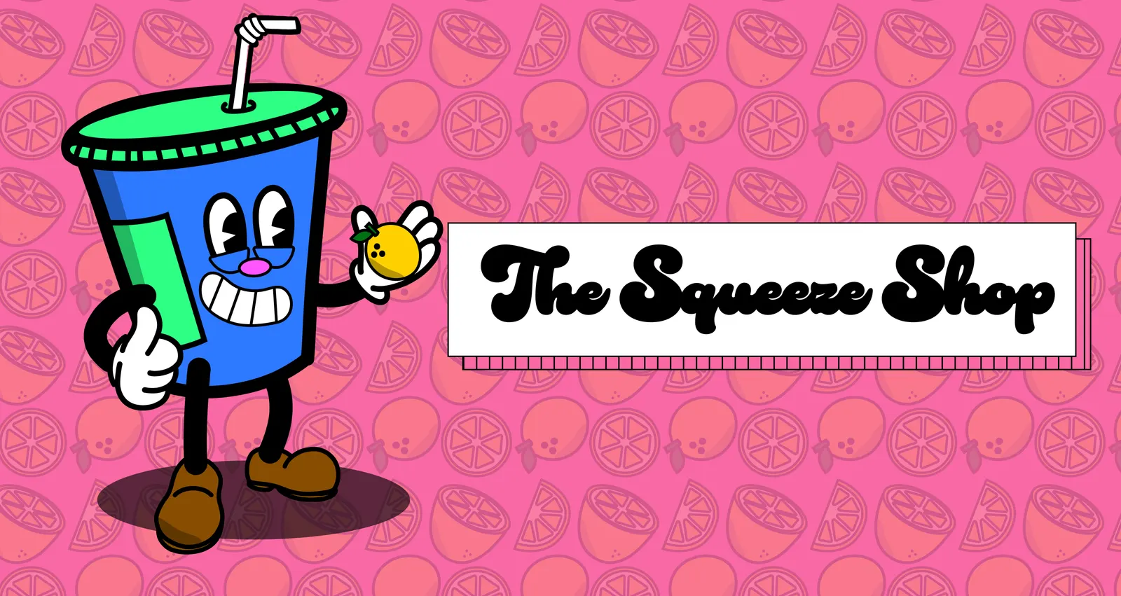
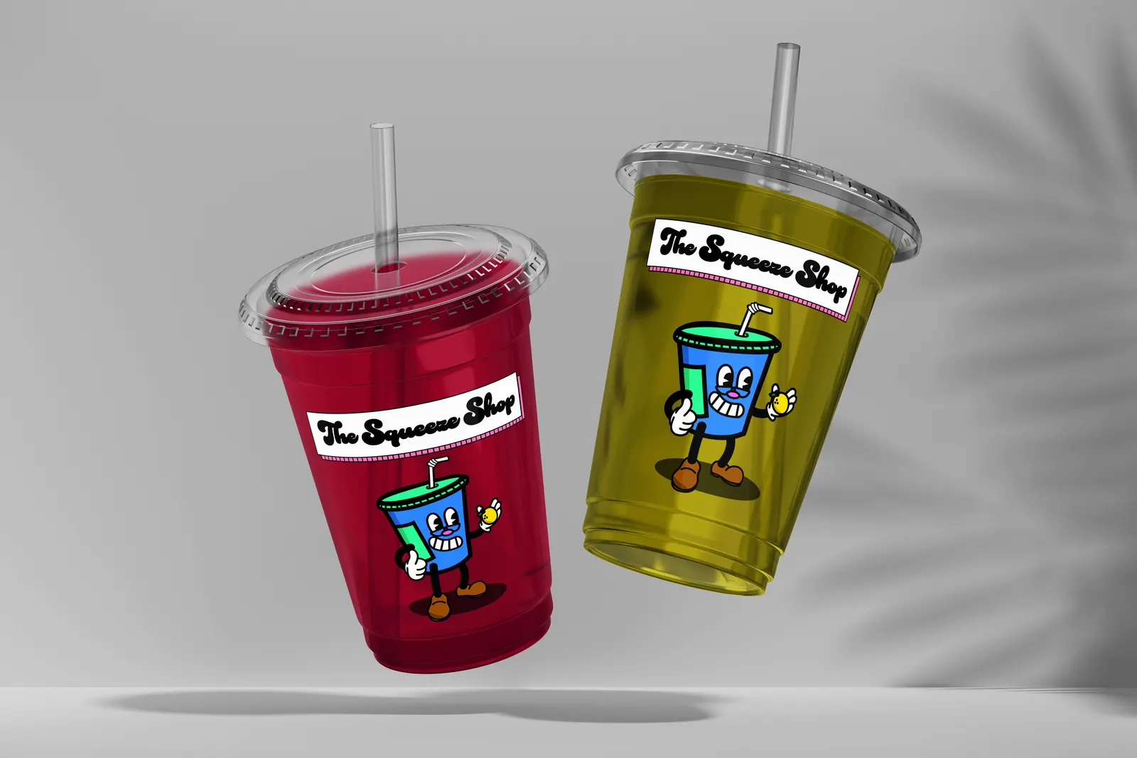
A blue cup with a green lid and a bendy straw, drawn in rubber-hose style: white gloves, brown shoes, a wide grin. One hand gives a thumbs-up and the other holds a lemon.
- 02
Logo and type
“The Squeeze Shop” is set in Duckie, a soft, bubbly retro script, in a white box with a pink striped shadow. Obviously Regular handles everything else.
- 03
Palette and pattern
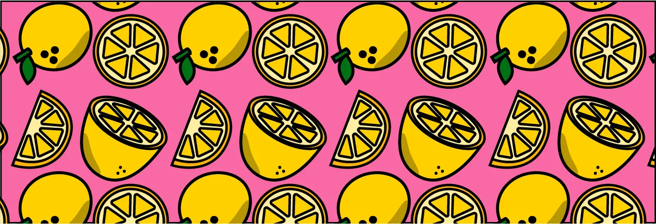
Five colors: black, Dodger Blue, French Pink, Lime Green and Yellow. A pattern of whole lemons, slices and halves fills backgrounds in pink or white.
- 04
Brand sheet
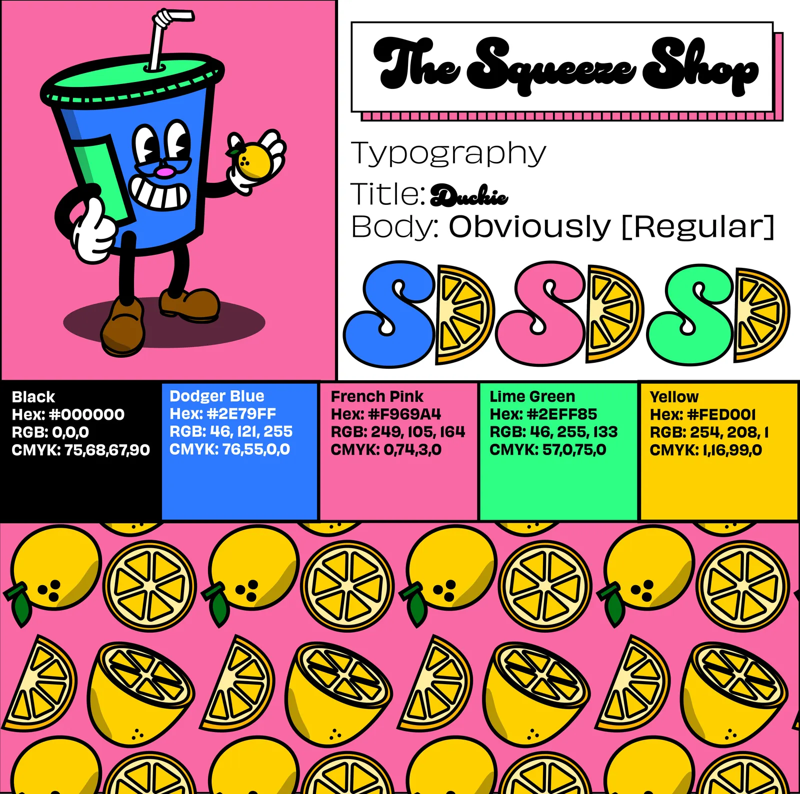
One page holds the mascot, the logo, the type, the color values (hex, RGB and CMYK) and the pattern, so anyone producing the brand has what they need.
- 05
Packaging and applications
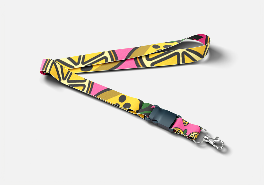
The system went onto cups, a lanyard, a billboard and a full can label for Strawberry & Peach Lemonade.
The work
The mascot
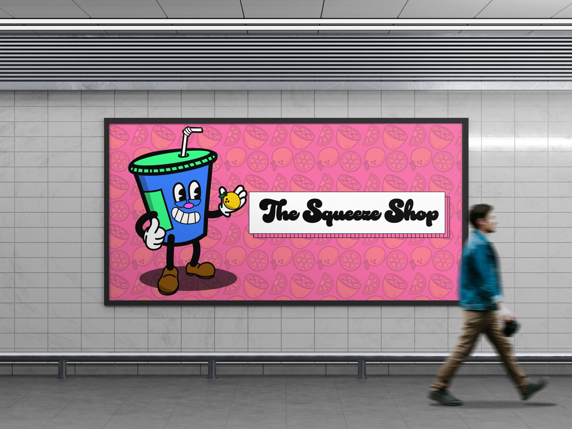
The cup is the brand. It shows up on every piece, from the billboard to the side of the can.

Brand sheet
Mascot, logo, typography, the SD monogram in three colors, the full palette with hex, RGB and CMYK values, and the lemon pattern, on one page.
Lemon pattern
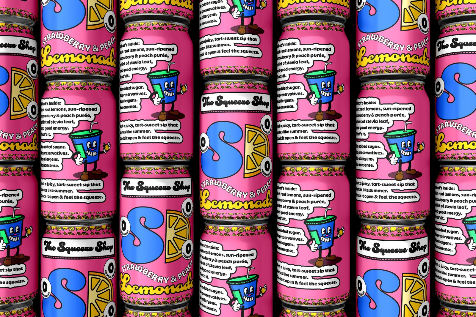
The can
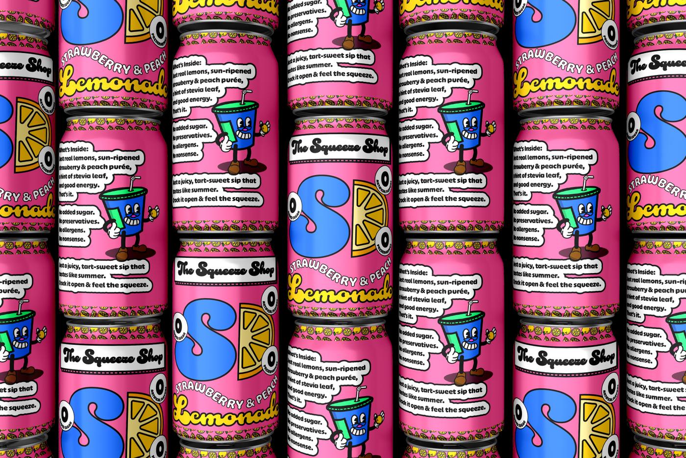
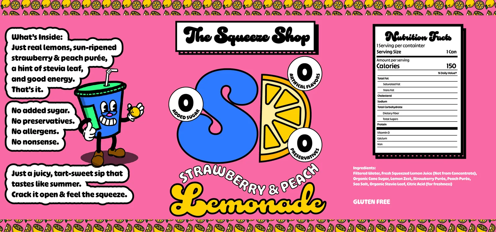
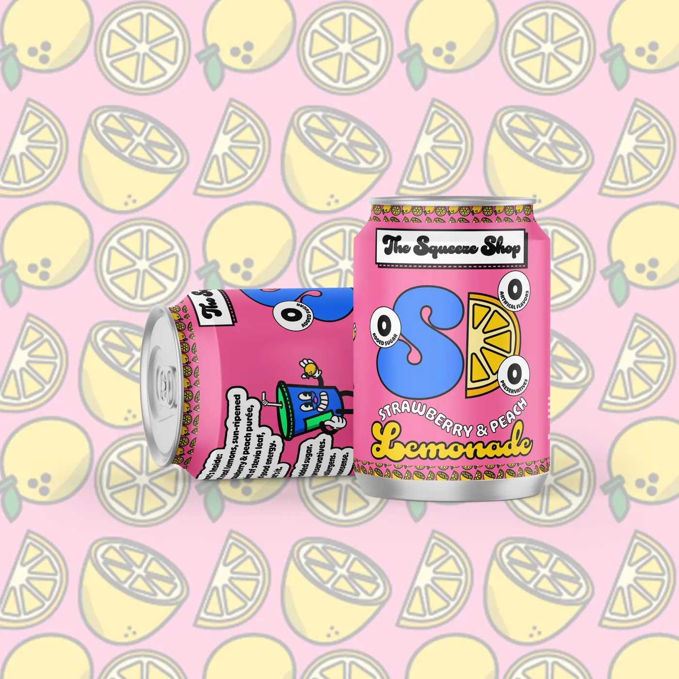
Strawberry & Peach Lemonade. The front leads with the SD monogram, a lemon slice and three “0” badges: added sugar, artificial flavors, preservatives. The back has the mascot, the ingredients in plain words and a nutrition panel.
Cups and merch
Design system
Bright, flat color, thick black outlines and rubber-hose cartoon style. Everything is drawn like it belongs in an old cartoon, but the colors are loud and modern.
#000000#2E79FF#F969A4#2EFF85#FED001Type
Duckie for titles: a soft, heavy retro script. Obviously Regular for body text.
Thick black outlines
Every shape, from the mascot to the lemons, has a heavy black line, so the art stays clear on any color.
The SD monogram
A fat “S” beside a lemon slice shaped like a “D.” It comes in blue, pink and green and leads the front of the can.
Boxed logo
The wordmark always sits in a white box with a pink striped shadow, so it reads on top of the busy pattern.
Timeline
Apr 2025
Identity
The mascot, logo, palette, lemon pattern and brand sheet, with the billboard, cup and lanyard mockups.
May 2025
Packaging
The Strawberry & Peach Lemonade can label, can mockups and a white version of the pattern.
The outcome
The Squeeze Shop has a character people can remember and a system that's easy to repeat: one mascot, one logo, five colors, two typefaces and a pattern.
The mockups show it on cups, a can, a lanyard and a billboard, and the brand sheet has everything needed for the next piece.
More work
 WebsiteClassic Rollers Car Club
 Photography2026 Graduation Pictures
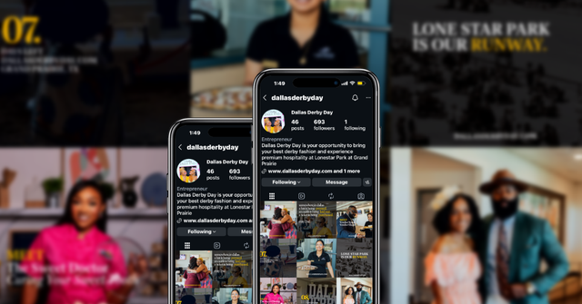 Social MediaDallas Derby Day
 UXSafeSpace
 Digital DesignBrewHaus
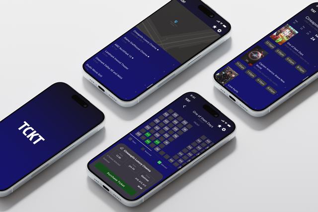 Product UXTCKT
 BrandingCurl & Co.
 BrandingDJ Mastamind
 BrandingThe Burrell Group
 UXSoulcheck
 Social MediaThrive Creative Studios Social Media Management + Graphics Creation
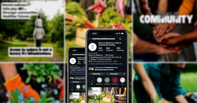 Social MediaRoots to Wellness Social Media Management + Graphics Creation