Curl & Co.
A hair-care brand drawn from a single curl
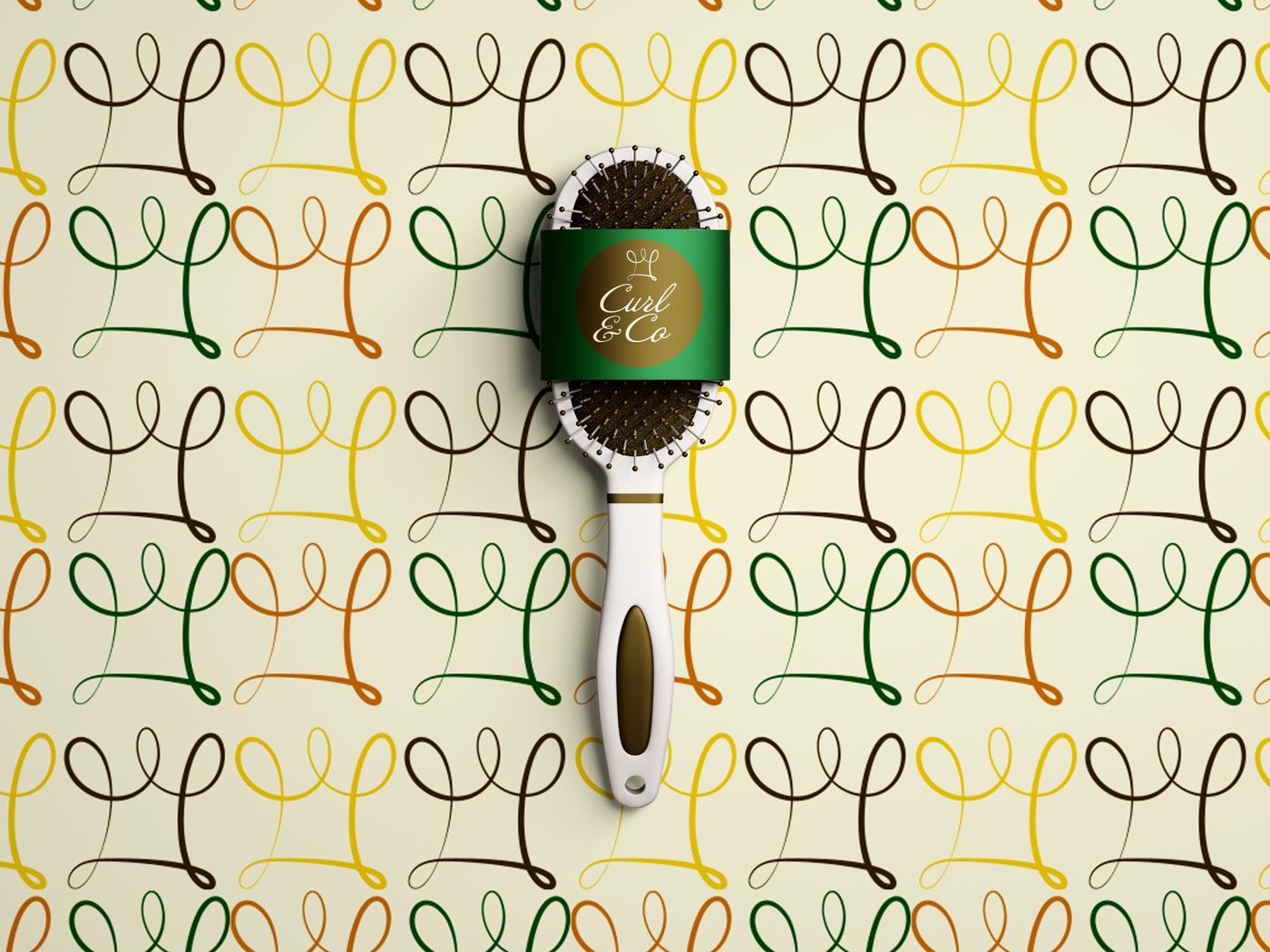
Curl & Co. is a beauty brand celebrating natural hair, confidence and individuality. Thrive built its visual system: a crown drawn from one looping line, a script wordmark, a warm five-color palette, a repeat pattern and the products and signage that carry it.
Overview
Curl & Co. is a hair-care brand built around natural curls. The identity combines softness with strength, so it feels elevated and approachable at the same time.
The project focused on color theory, typography and cultural storytelling: how a brand can reflect the people it serves, and make them feel seen.
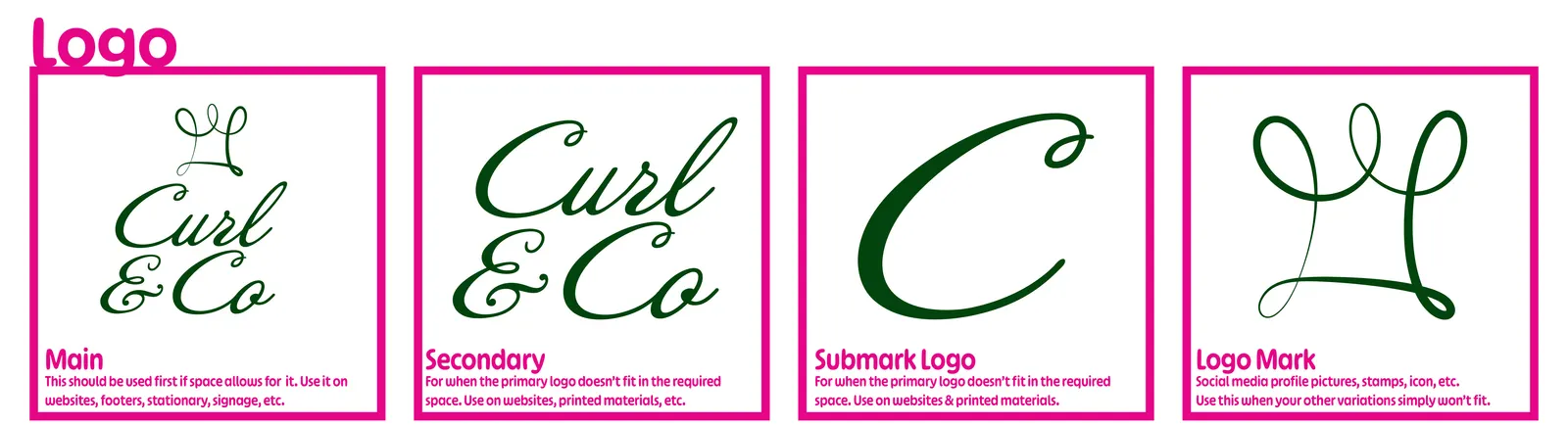
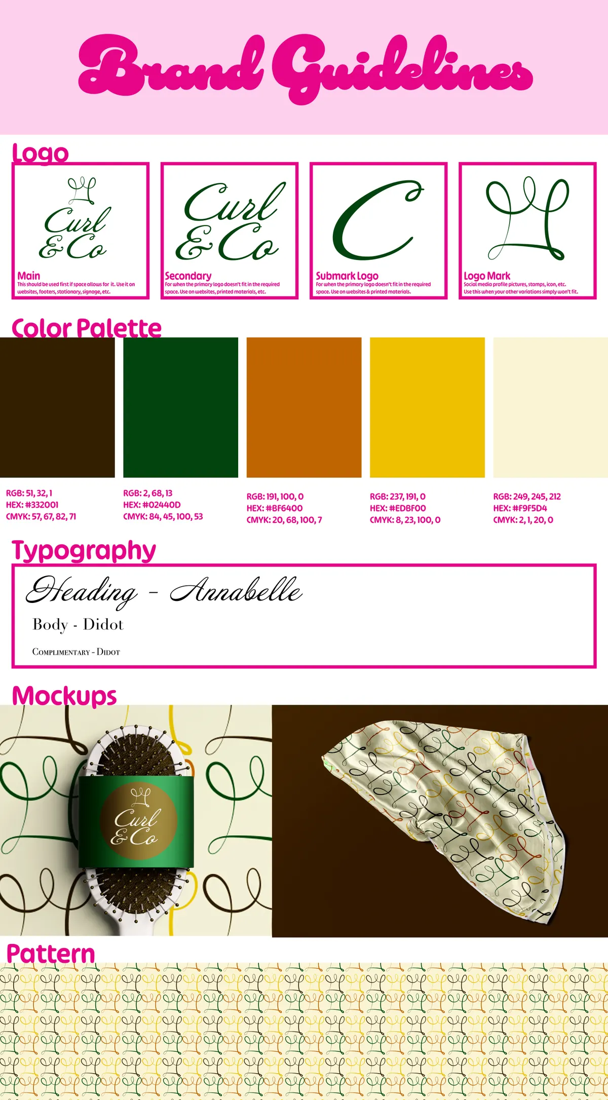
Logo versions: main, secondary, submark and logo mark
Brand colors
Typefaces: Annabelle and Didot
The challenge
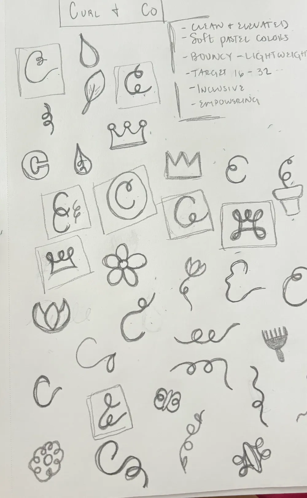
The early brief, written in the margin of the first sketch page, set the direction: clean and elevated, bouncy and lightweight, inclusive and empowering, for an audience of roughly 16 to 32.
Feel like self-care with personality
Polished enough for a bathroom shelf, playful enough to feel personal.
Build a system, not just a logo
Logo versions, colors, type and a pattern that can grow into new products.
Readable and expressive type
A script with character for headings, paired with a clean serif that stays easy to read.
Social-first
A logo mark small and simple enough for a profile picture, stamp or icon.
The approach
- 01
Sketching
A page of pencil ideas: C letterforms, crowns, drops, leaves, flowers, a pick comb and loose curl lines. The crown and curl ideas came together into the final mark.
- 02
The mark
A crown drawn from a single looping line, like a curl, that sits above a script “Curl & Co” wordmark.
- 03
Logo versions
Four lockups for different spaces: the main logo, a secondary wordmark, a script C submark and the crown on its own.
- 04
Color, type and pattern
Five colors with RGB, HEX and CMYK values, Annabelle and Didot for type, and the crown mark repeated in four of the colors on cream as a pattern.
- 05
Applications
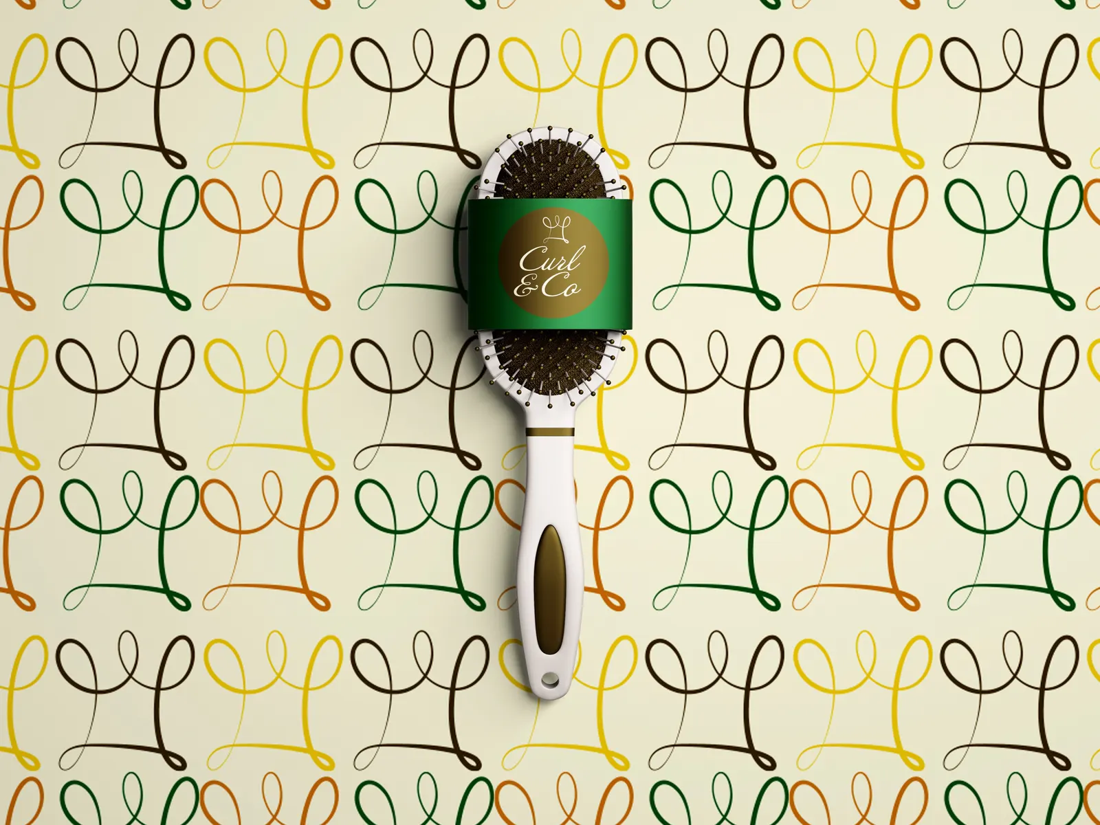
Shampoo and conditioner bottles, a hairbrush band, a satin hair scarf and a storefront sign, mocked up to test the system.
The work
Sketches
Where it started: dozens of quick marks around the words “Curl & Co,” with the brief written beside them.
Logo
The main logo goes first wherever there's room: websites, footers, stationery and signage. The secondary and submark cover tighter spaces, and the logo mark handles social profile pictures, stamps and icons.
Pattern
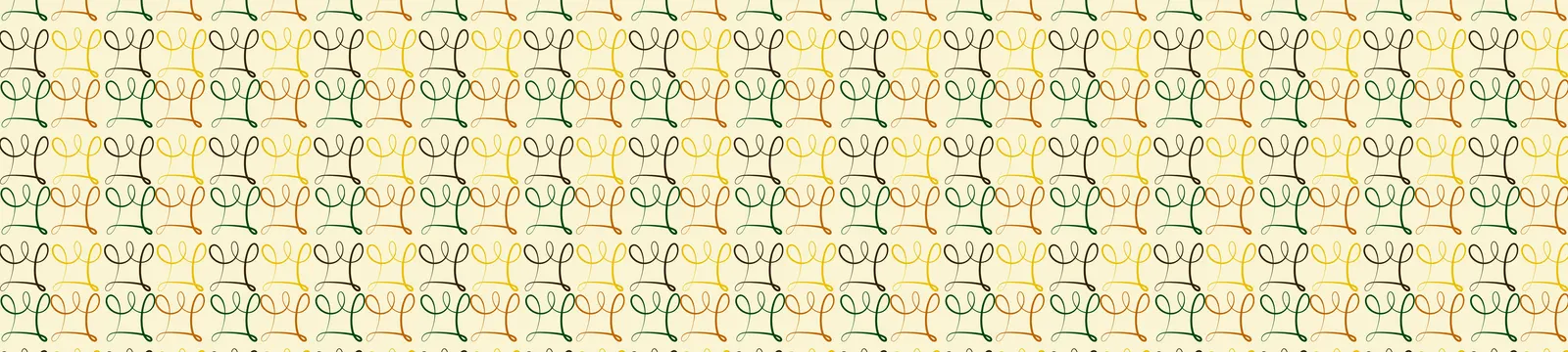
The crown mark repeated in brown, green, orange and yellow on cream, for packaging, fabric and backgrounds.
Applications
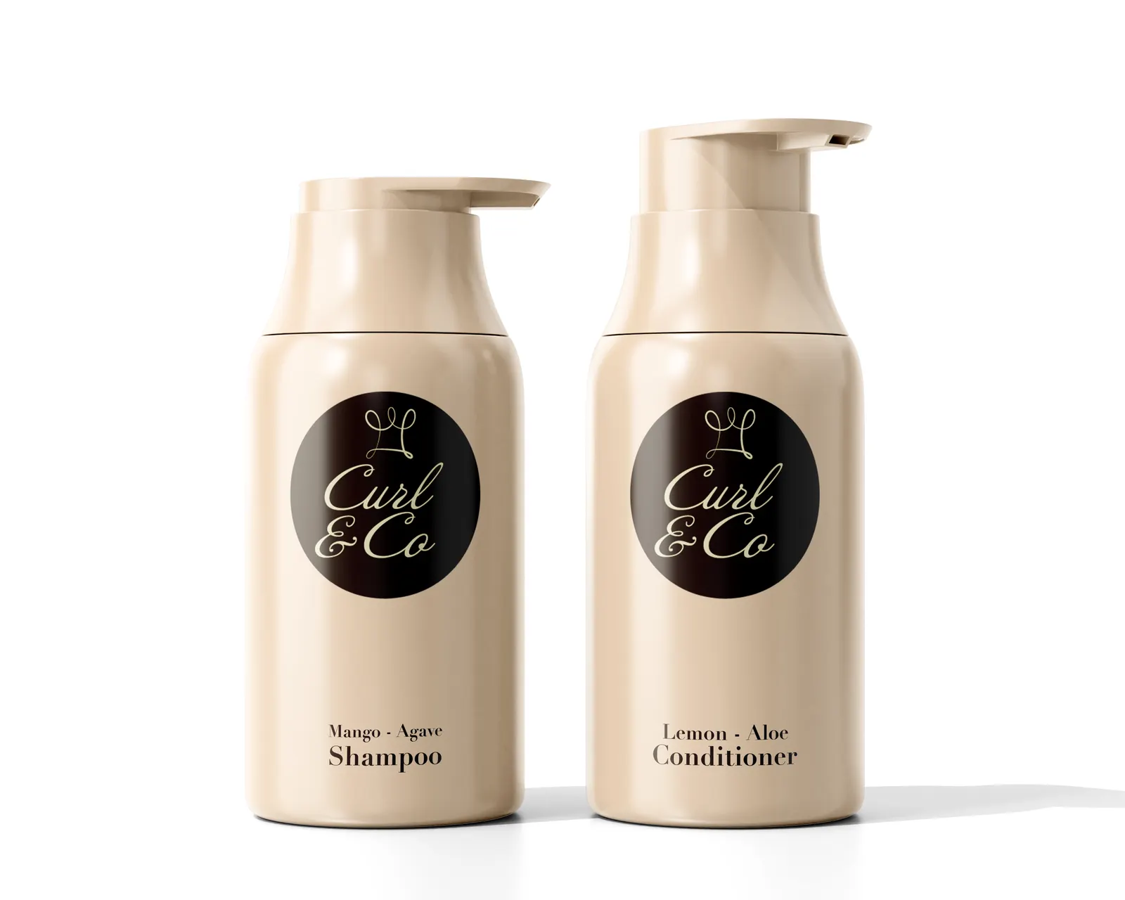
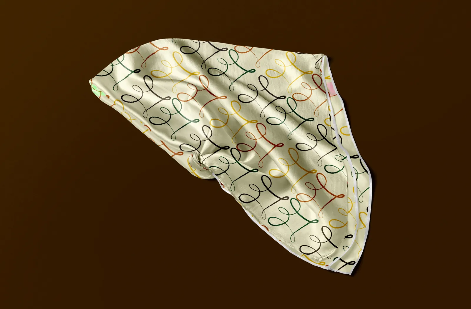
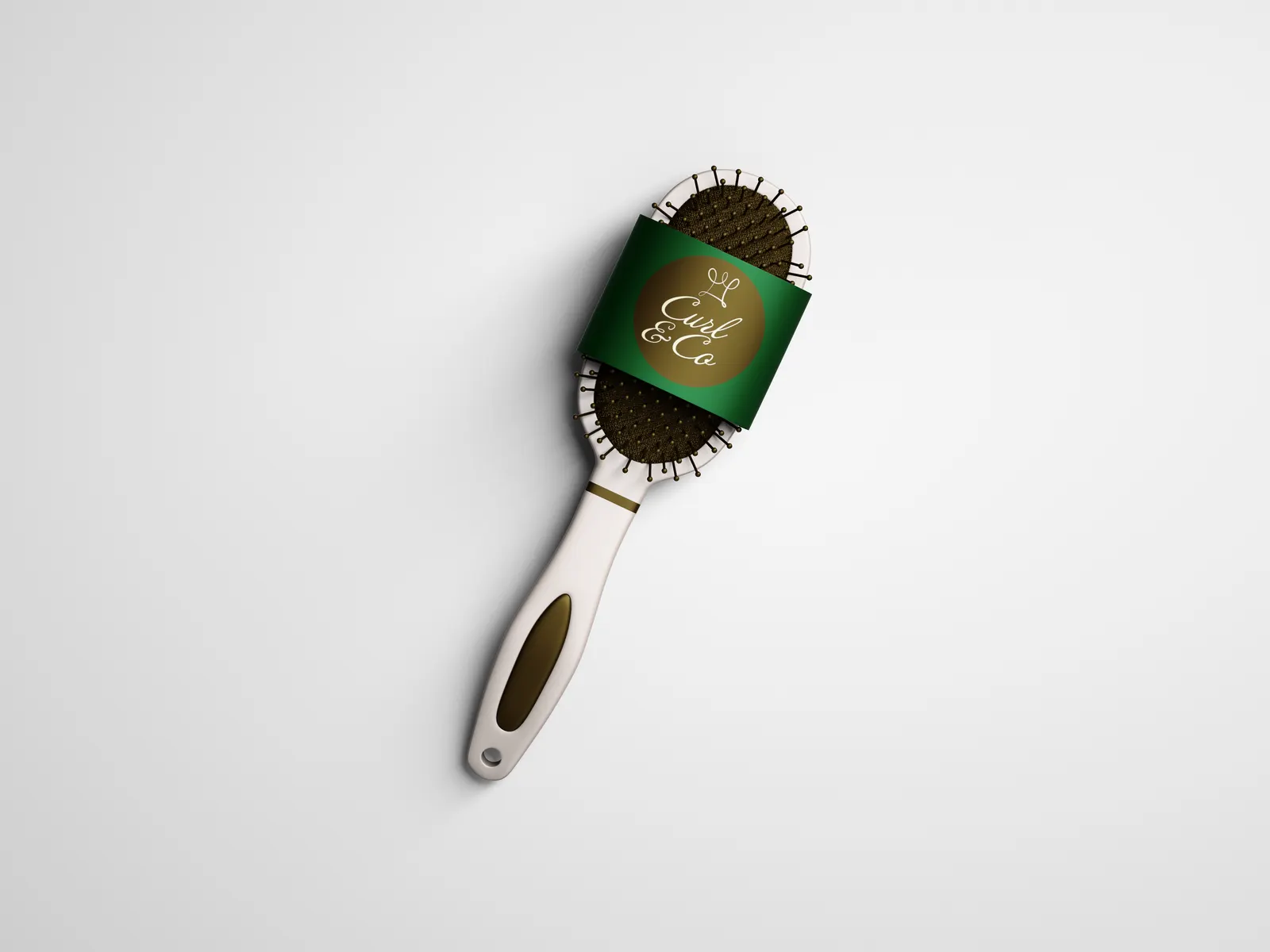
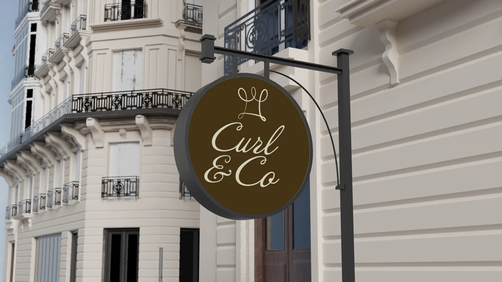
Mango–Agave shampoo and Lemon–Aloe conditioner carry the logo in a dark circle. The pattern becomes a satin hair scarf, the brush gets a branded band, and the main logo hangs as a round shop sign.
Design system
Deep brown and forest green give the brand its strength; burnt orange, golden yellow and cream bring warmth. The script type and looping mark supply the softness.
#332001#02440D#BF6400#EDBF00#F9F5D4Type
Headings in Annabelle, a flowing script. Body copy in Didot, with Didot small caps as the complementary style.
One line, one curl
The crown mark is drawn as a single continuous looping line, echoing a curl.
A crown for confidence
The mark sits above the name like a crown, tying the logo to the brand's message of confidence.
Logo in a circle
On bottles, the brush band and the sign, the logo sits in a solid circle, so it reads on any surface.
Pattern in every color
Each repeat of the mark takes a different brand color, so the pattern shows the whole palette at once on its cream ground.
Full pages. Hover over one (or scroll inside it on a phone) to see the whole page.
The outcome
Curl & Co. has a complete visual system: four logo versions with clear rules for when to use each, a five-color palette, a type pairing and a pattern, all documented in one brand guidelines sheet.
The mockups show it holding together across bottles, accessories, fabric and signage, with a logo mark ready for social profiles.
More work
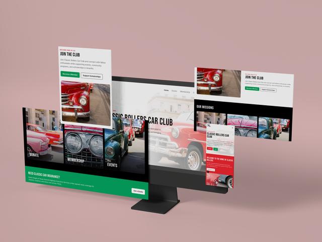 WebsiteClassic Rollers Car Club
 Photography2026 Graduation Pictures
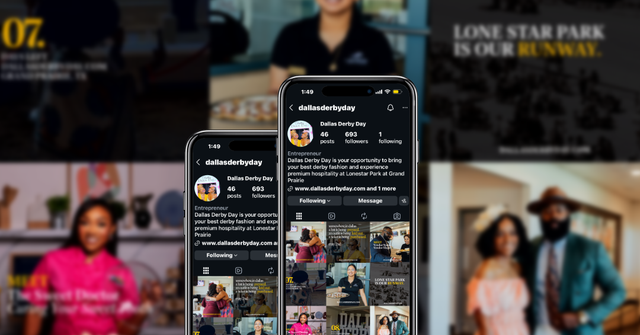 Social MediaDallas Derby Day
 UXSafeSpace
 Digital DesignBrewHaus
 Product UXTCKT
 BrandingDJ Mastamind
 BrandingThe Squeeze Shop
 BrandingThe Burrell Group
 UXSoulcheck
 Social MediaThrive Creative Studios Social Media Management + Graphics Creation
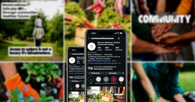 Social MediaRoots to Wellness Social Media Management + Graphics Creation