TCKT
Movie tickets in one app, from any theater
TCKT is an app for buying movie tickets. It links your Fandango, Cinemark, AMC and Regal accounts once, then takes you from nearby theaters to showtimes, seats and checkout in a single straight path. Thrive researched, mapped, designed and prototyped it, and built the brand around it.
Overview
Buying a movie ticket often means juggling apps: one theater chain's app for one cinema, a ticketing site for another, separate logins and separate loyalty points in each.
TCKT puts every nearby theater in one place. Sign in once, pick a theater, a showtime and your seats, and pay on one screen — with your rewards tracked in the same app.
Steps from opening the app to a confirmed ticket
Ticketing accounts linked at sign-up
Wireframed screens
The challenge
People buy tickets under time pressure, often on a phone, sometimes in the lobby. Every extra screen or login is a chance to give up.
One app for every theater
Link Fandango, Cinemark, AMC and Regal accounts once instead of switching between apps.
A shorter checkout
Seats, price, date, ticket type and the total on one sheet, with one Purchase button.
Rewards you can actually see
Savings and rewards trackers in settings, alongside past purchases.
Fast to scan
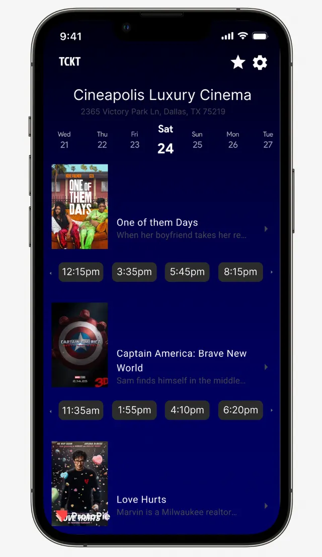
Showtimes as large tap targets under each film, and a clear seat map.
The approach
- 01
Research
Thrive surveyed moviegoers about ticketing pain points, interviewed frequent Fandango and Cinemark users, and compared the major ticketing apps, including Fandango and Atom Tickets.
- 02
Affinity mapping
Frustrations were sorted in Mural. Multiple logins, long checkouts and confusing loyalty points came out on top.
- 03
User flow
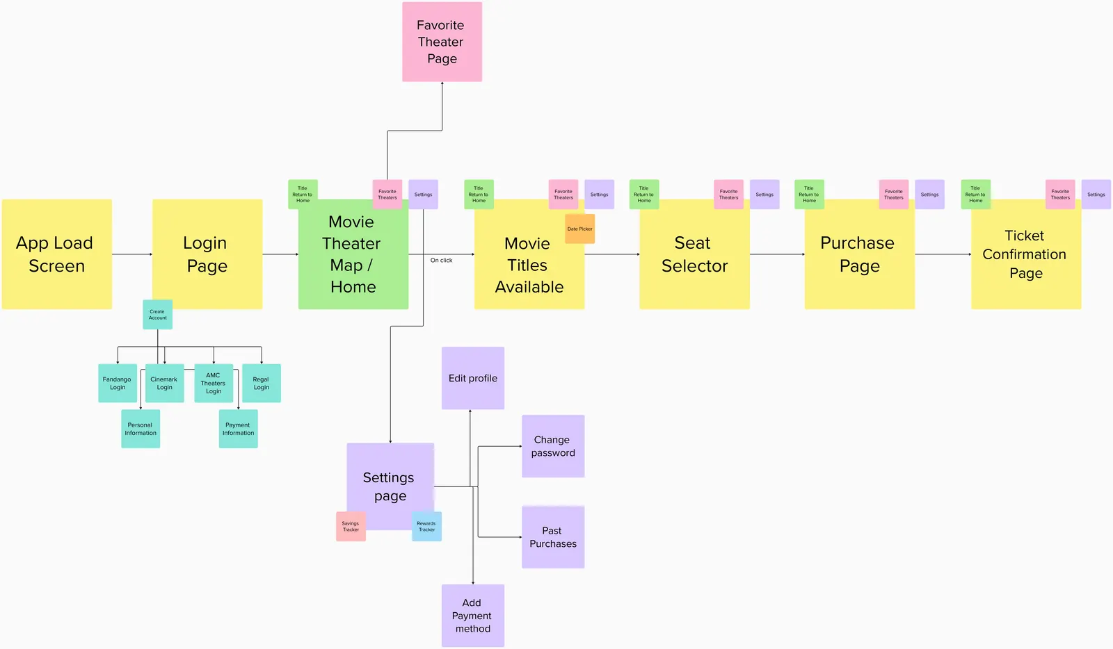
One straight path — app load, login, theater map, films, seat selector, purchase, confirmation — with favorites and settings reachable from every step.
- 04
Wireframes
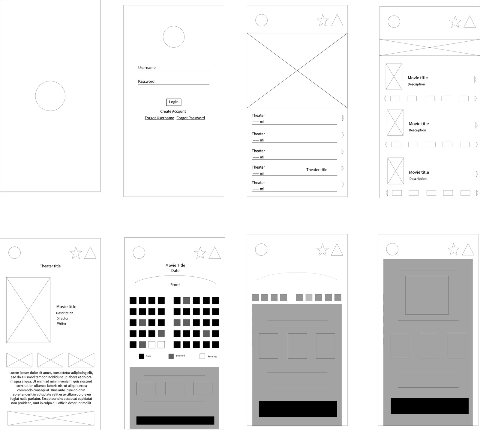
Eight low-fidelity screens to test the flow before any color or type.
- 05
UI and prototype
High-fidelity screens in Figma, wired into a clickable prototype in ProtoPie.
- 06
Testing and refinement
The prototype was tested with research participants and refined from what they said, especially around loyalty tracking.
- 07
Brand
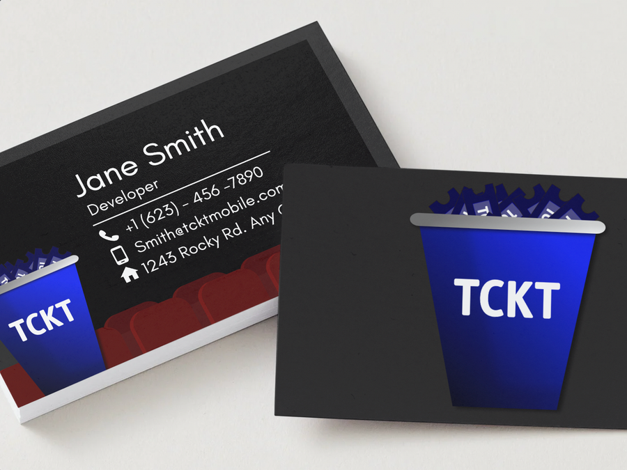
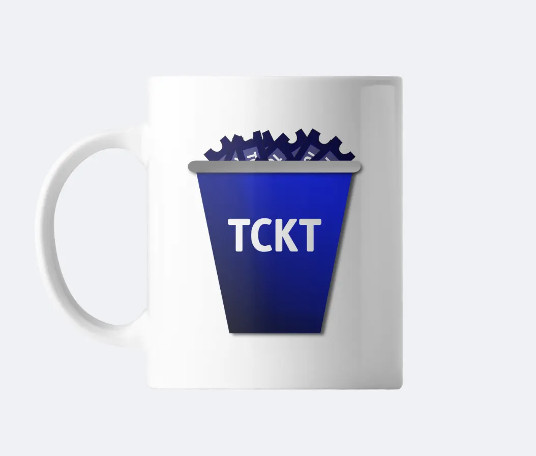
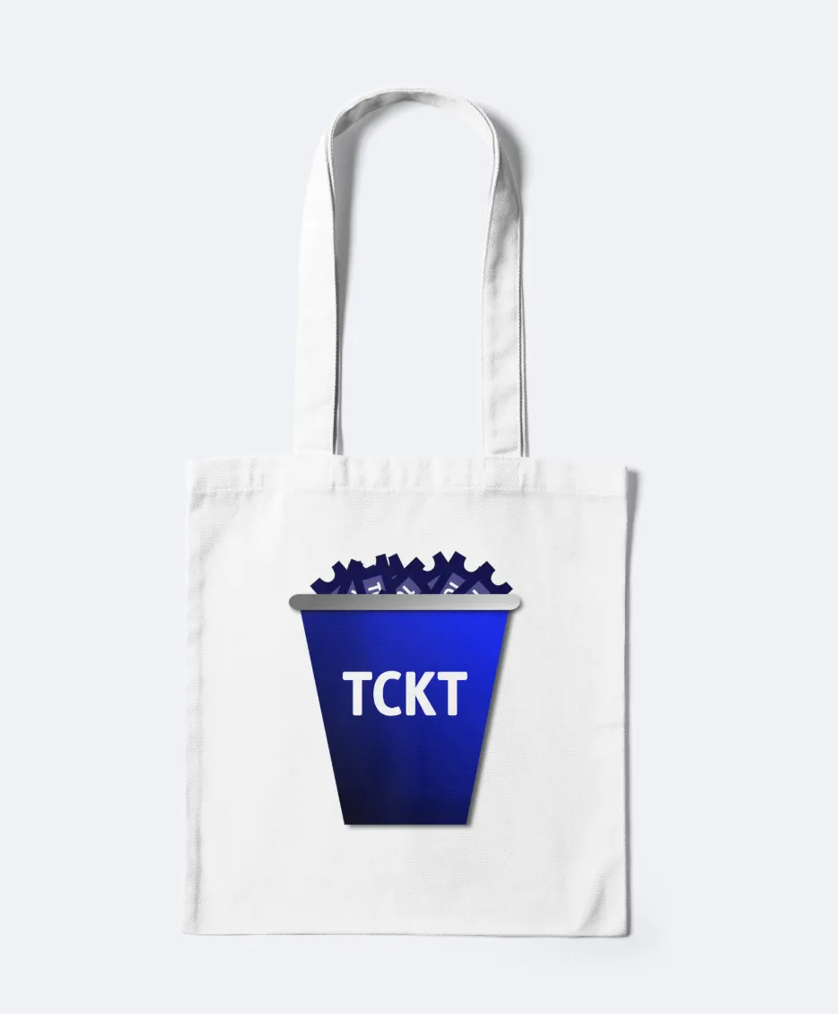
A logo, palette, voice and guidelines, shown on merchandise and print mockups.
The work
The core screens
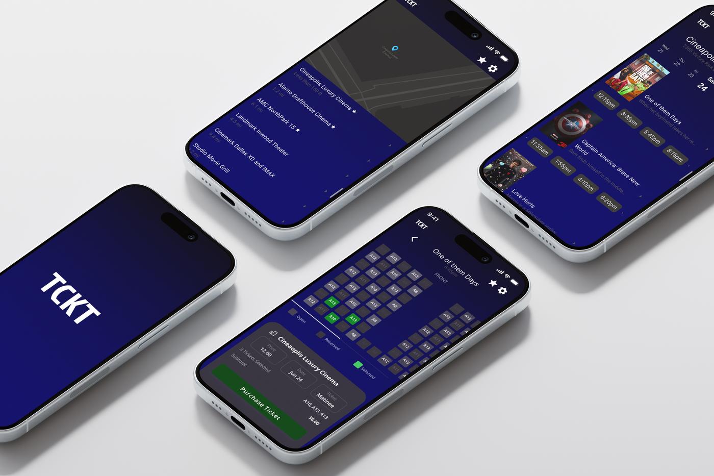
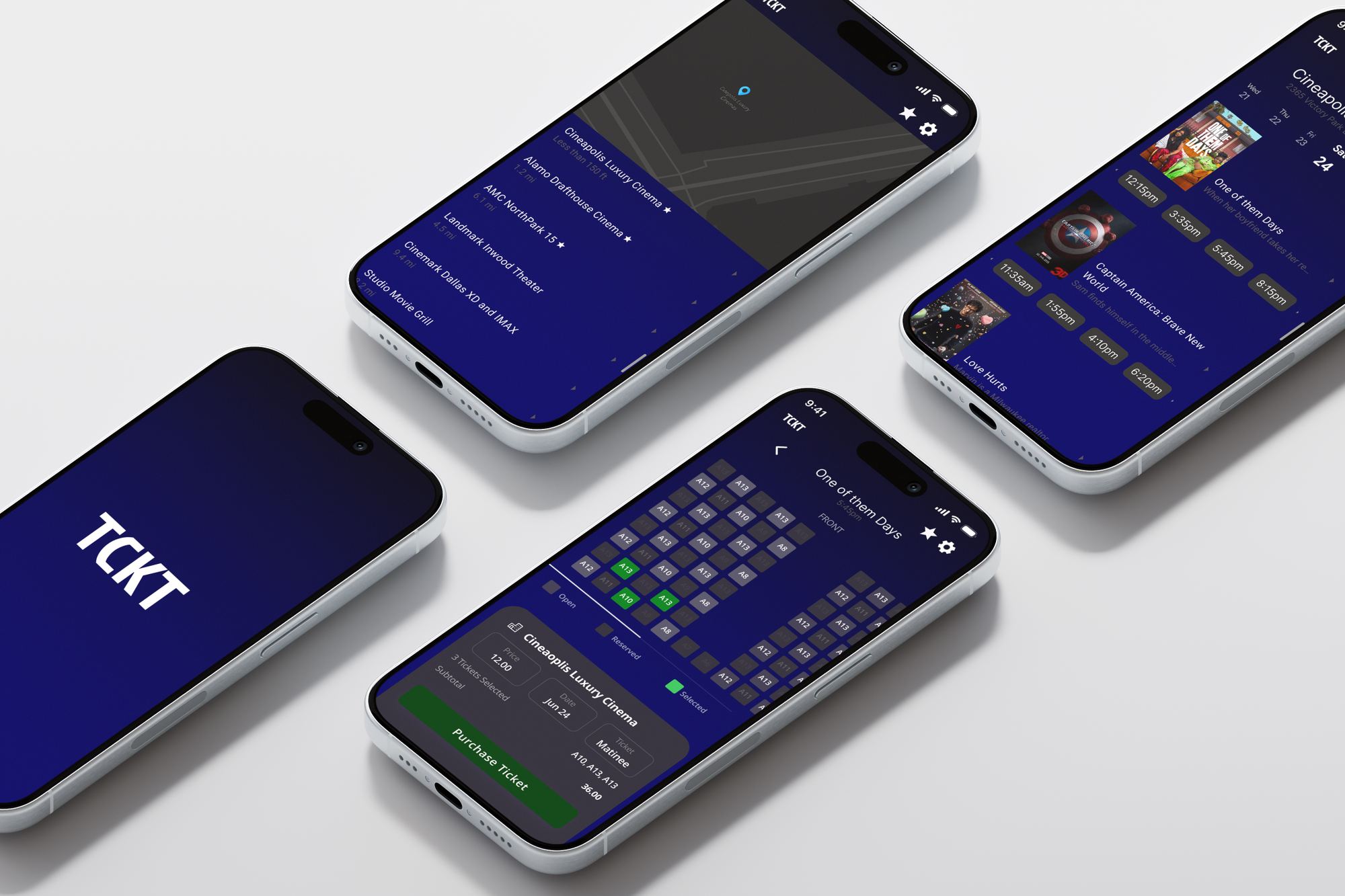
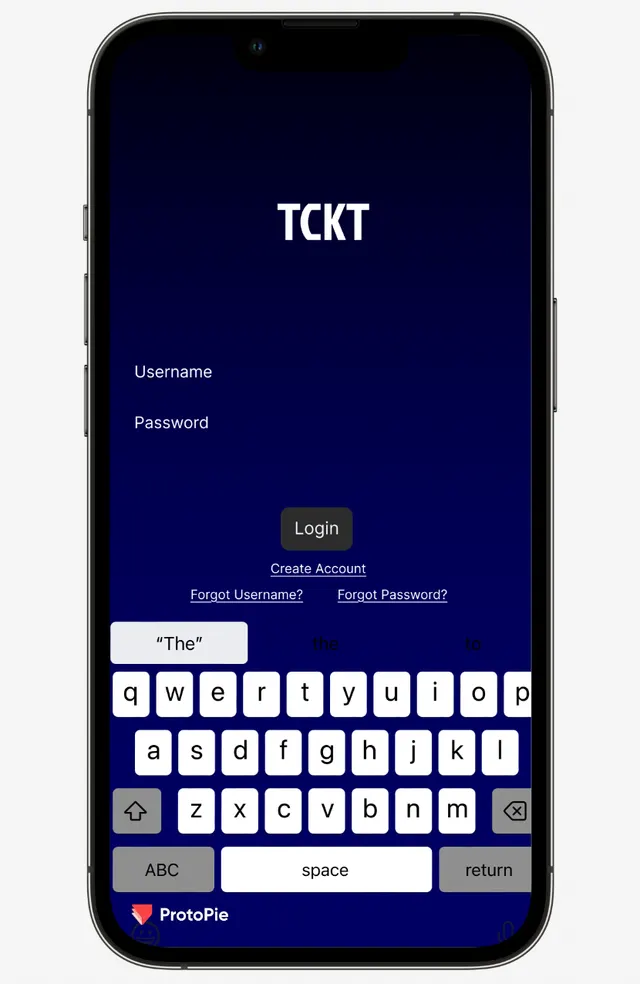
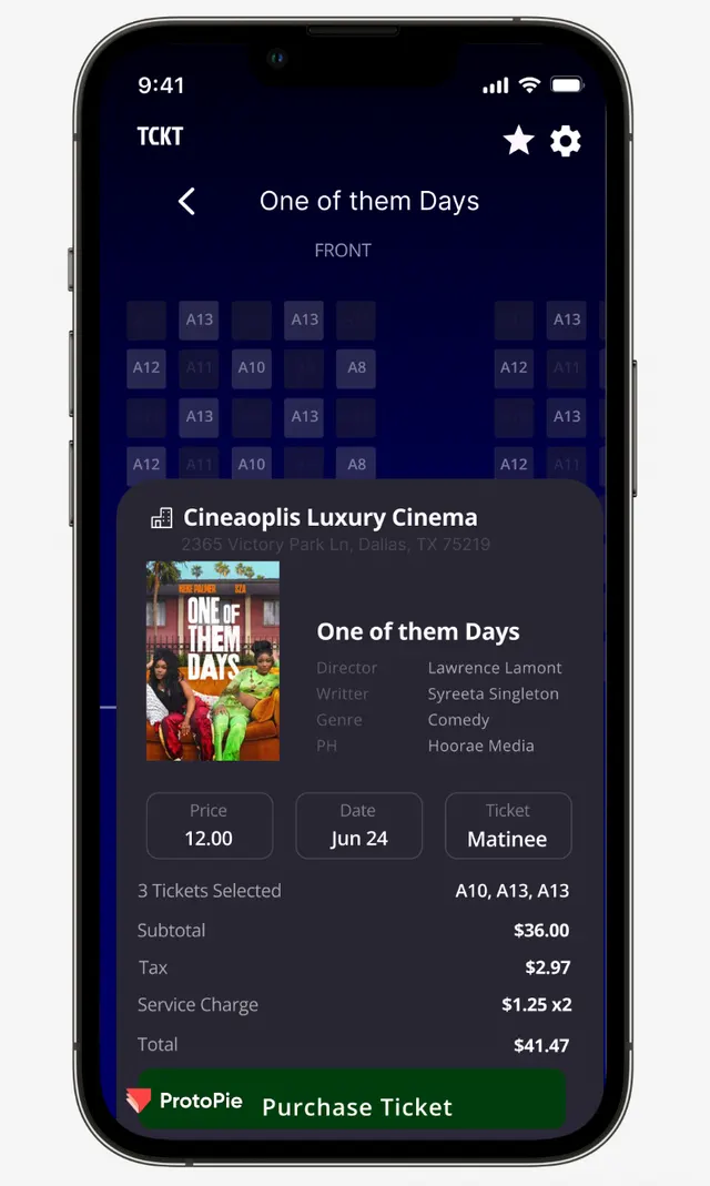
From the prototype: the splash screen, sign-in, a theater's showtimes by day, and the seat map with the checkout sheet pulled up.
User flow
Seven steps in a straight line. Sign-up branches off to link each ticketing account; settings holds the profile, password, past purchases, payment methods and the savings and rewards trackers.
Wireframes
The same flow in grayscale: splash, sign-in, theater list, films and showtimes, film details, seat map and the checkout sheet.
Brand in use
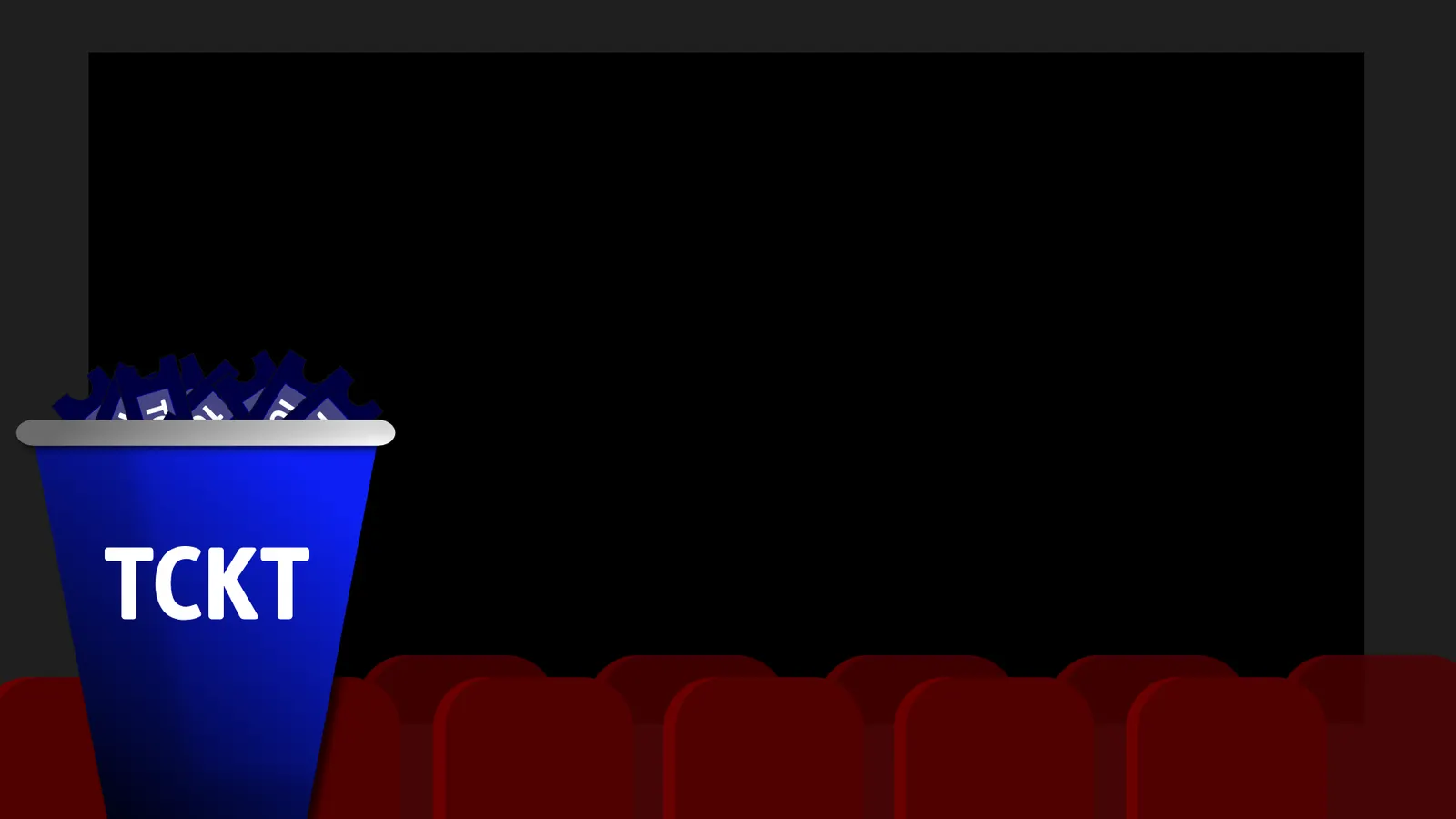
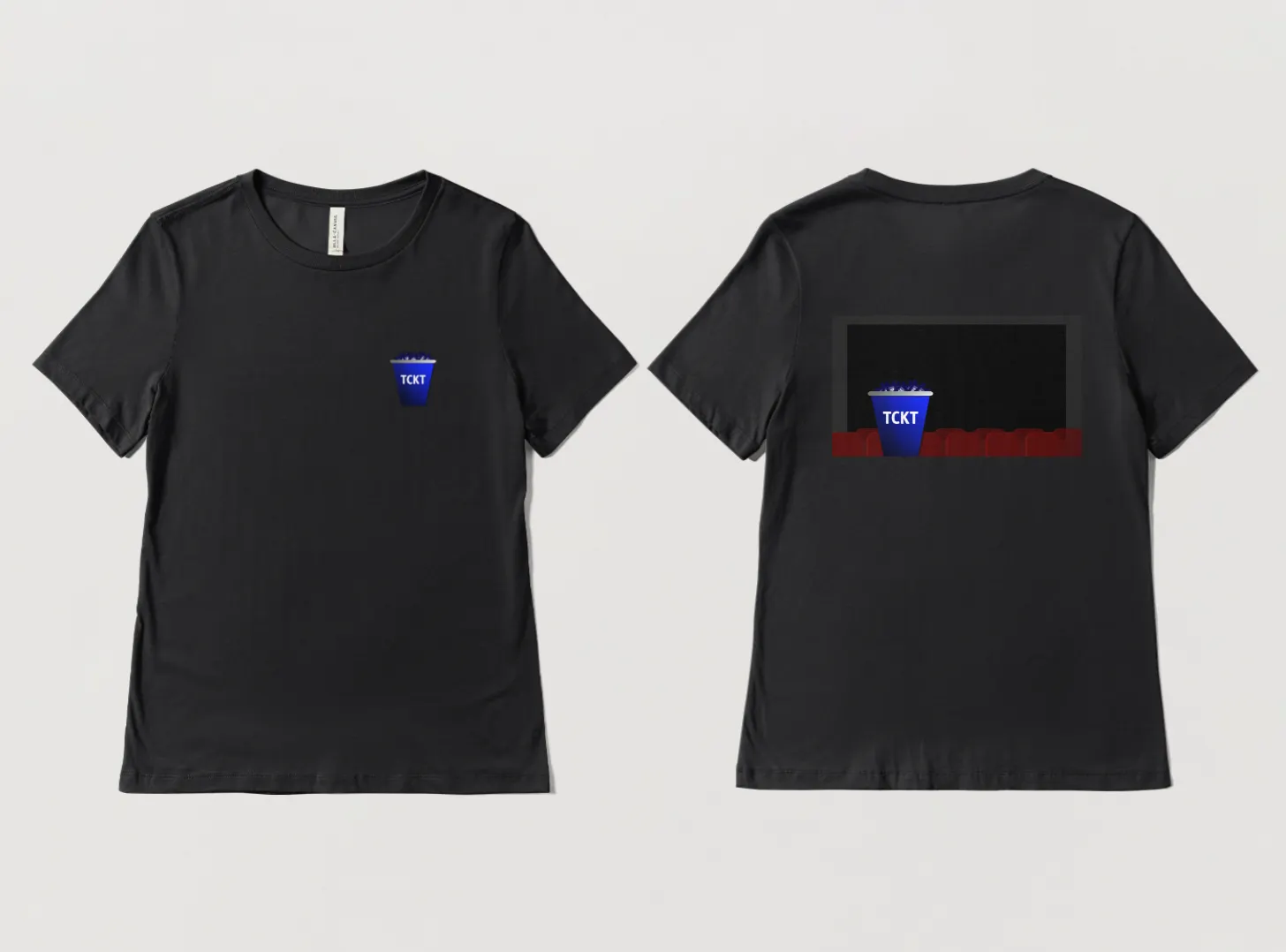
A popcorn bucket overflowing with tickets: every theater's tickets in one place.

What it does
Every nearby theater
A map and list of theaters with distances, favorites marked with a star.
Showtimes by day
Pick a day from the strip at the top; each film shows its showtimes as buttons.
Clear seat map
Open, reserved and selected seats in distinct tones, with the screen marked at the front.
One-sheet checkout
Film, theater, price, date, ticket type, seats, tax, service charge and total, then one Purchase button.
Always one tap away
Favorites and settings sit in the header of every screen; the TCKT title takes you home.
Rewards in one place
Savings and rewards trackers and past purchases live together in settings.
Design system
Modern and a little nostalgic: a deep theater blue for the app, red borrowed from cinema seats, and a bold all-caps wordmark that reads like a marquee.
#0A1F52#9B2323#FFFFFF#DBD9DB#747572Type
Bold, all-caps headlines for the wordmark and key messages, with a clean, minimal sans-serif for film details, showtimes and prices.
Dark screens
A deep blue gradient keeps the app easy on the eyes in a dark lobby or theater.
Big tap targets
Showtimes and seats are large, rounded buttons you can hit while walking.
A sheet, not a page
Checkout slides up over the seat map, so you never lose sight of what you picked.
The outcome
TCKT ended as a clickable prototype covering the whole path from sign-in to a confirmed ticket, plus a full brand with guidelines.
The design turns a crowded task into one straight flow, keeps the hierarchy clear on small screens, and is built for people in a hurry.
More work
 WebsiteClassic Rollers Car Club
 Photography2026 Graduation Pictures
 Social MediaDallas Derby Day
 UXSafeSpace
 Digital DesignBrewHaus
 BrandingCurl & Co.
 BrandingDJ Mastamind
 BrandingThe Squeeze Shop
 BrandingThe Burrell Group
 UXSoulcheck
 Social MediaThrive Creative Studios Social Media Management + Graphics Creation
 Social MediaRoots to Wellness Social Media Management + Graphics Creation