Thrive Creative Studios Social Media Management + Graphics Creation
A studio feed that shows the work and says what it believes
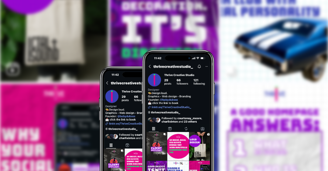
Thrive runs its own Instagram the way it would run a client's: a clear visual system, a set of repeatable post formats and a steady publishing rhythm. The feed explains how Thrive thinks about design, walks through real client projects and points people to the site.
Overview
Thrive Creative Studios is Lauren Burrell's Dallas design studio. It offers branding, web development, UX design, social media and photography.
Instagram is where many small businesses first see Thrive's work, so the account has to do two jobs: show finished projects and make the case for clear, purposeful design.
Client spotlight carousels
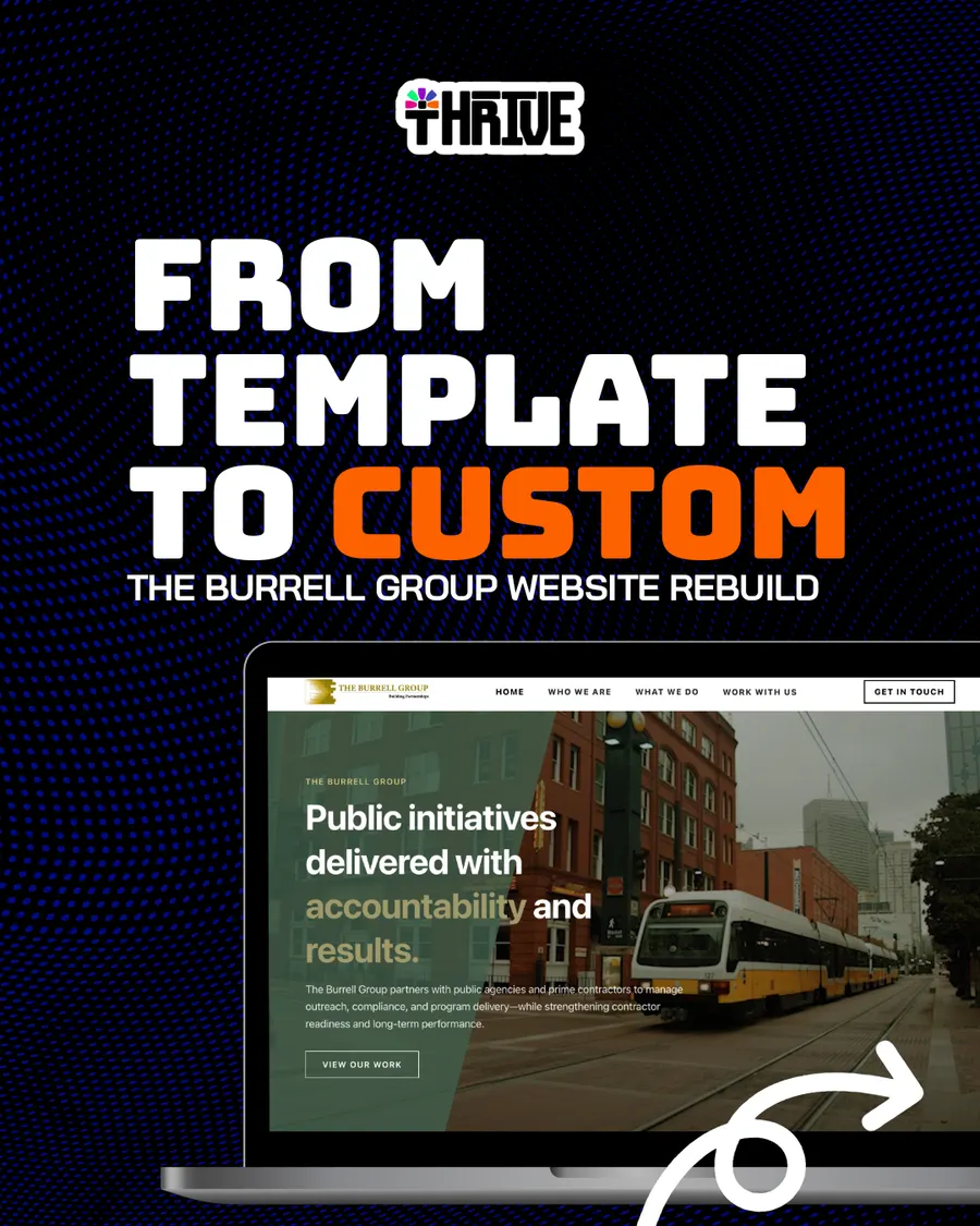
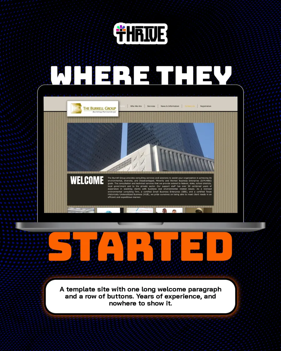
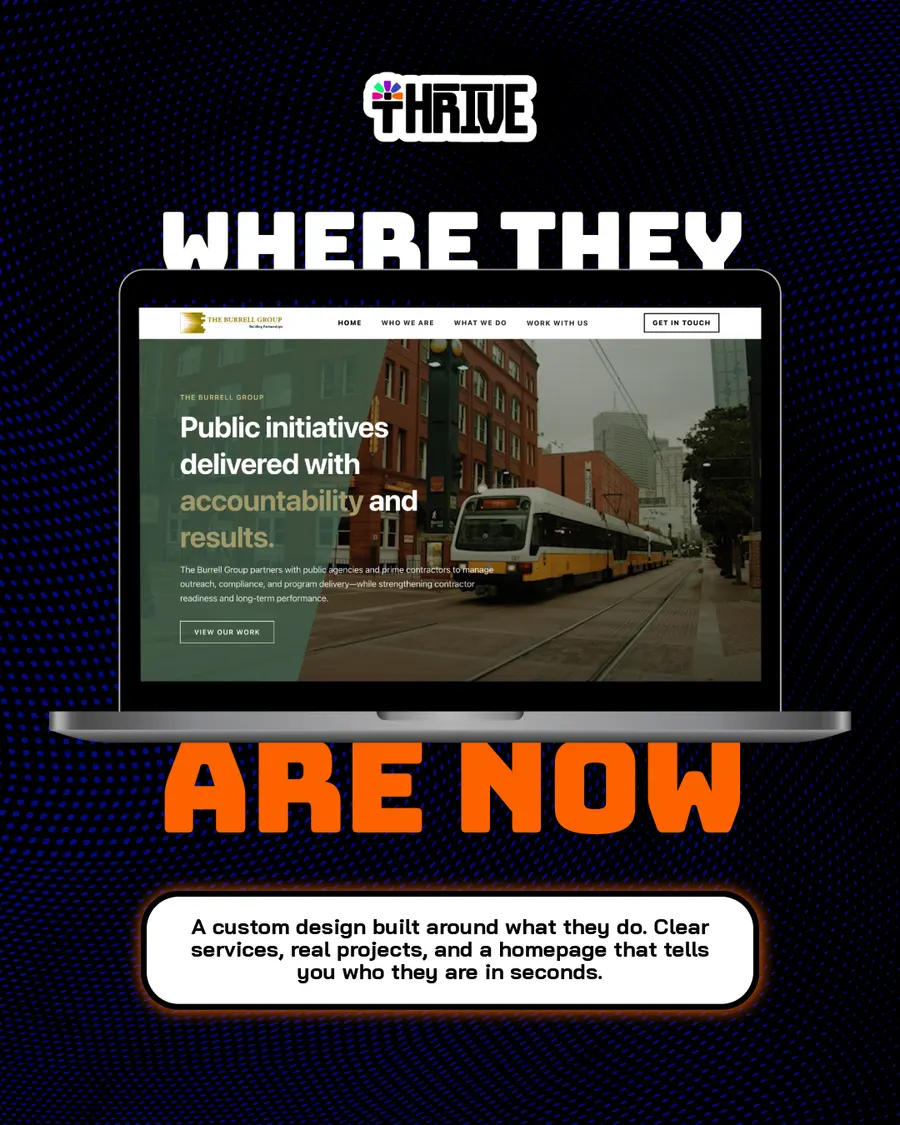
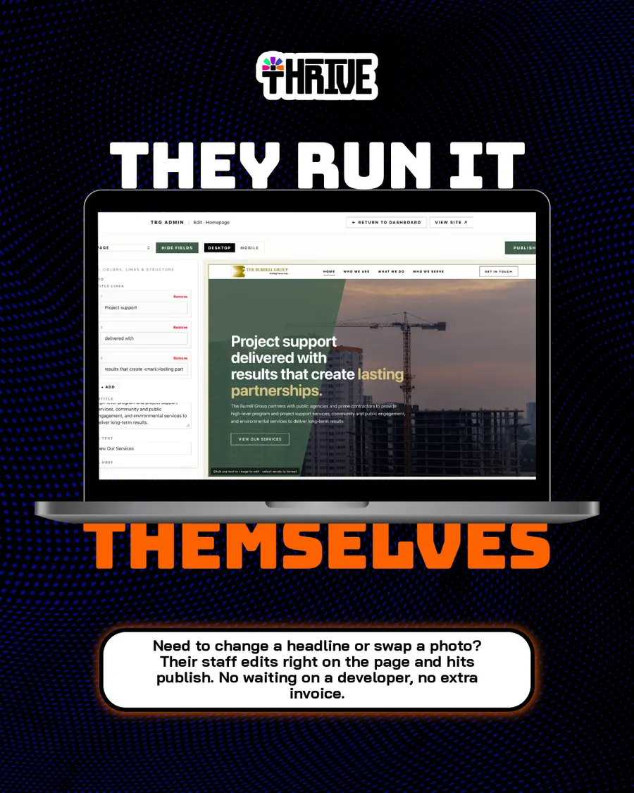
Slides in the website rebuild carousel
Post formats: feed posts, carousels, spotlights, stories
The challenge
The account needed a clearer visual system and a more predictable posting rhythm, so people would recognize a Thrive post at a glance and know what to expect from the feed.
Look like one brand
Every post should use the same colors, type and logo, whatever the topic.
Post on a rhythm
A monthly content structure, so publishing doesn't depend on inspiration.
Show the thinking, not just the visuals
Explain why design choices matter to a business, in plain words.
Turn finished work into content
Every client project becomes a post series that shows the before, the process and the result.
The approach
The work was split into a few post formats that repeat, each with its own job.
- 01
Monthly content structure
A plan for each month that mixes point-of-view posts, client work, stories and seasonal posts.
- 02
Point-of-view posts
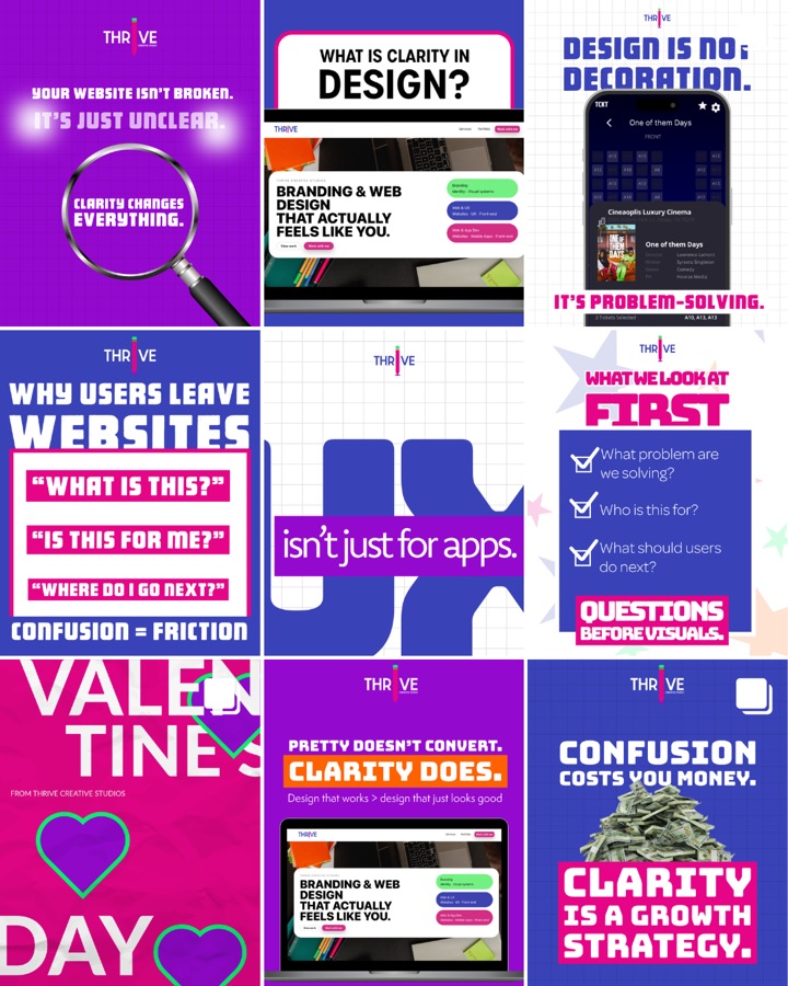
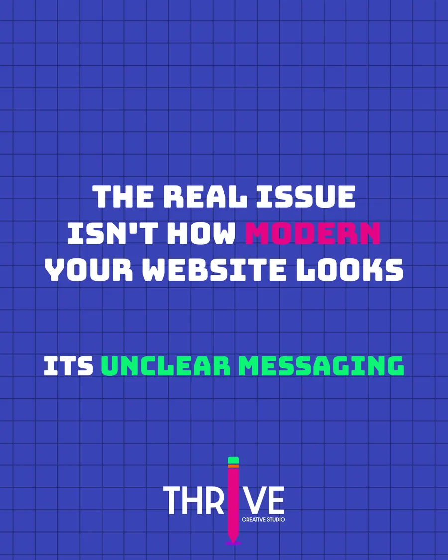
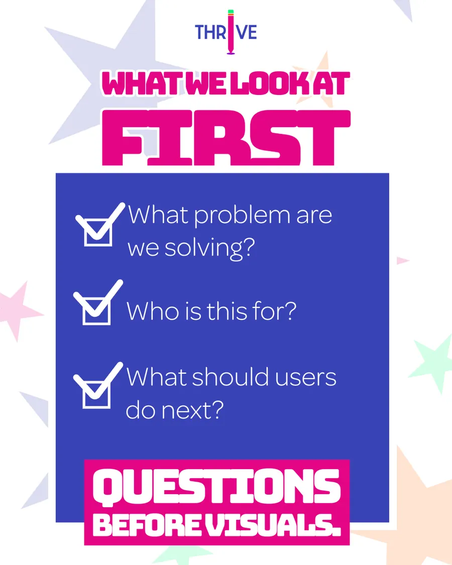
Single-image posts with one short idea each: clarity over decoration, questions before visuals, messaging over trends.
- 03
Client spotlights
Multi-slide carousels that walk through a client's brief, logo, visual language and final product.
- 04
Case-study carousels
A website rebuild told slide by slide: where the client started, where they are now and what they can do themselves.
- 05
Stories
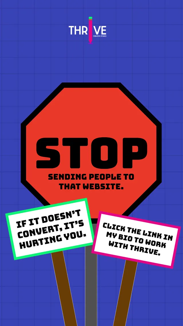
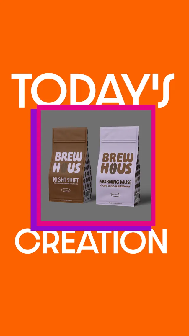
Vertical graphics for quick tips, today's creation and calls to work with Thrive.
The work
Point-of-view posts
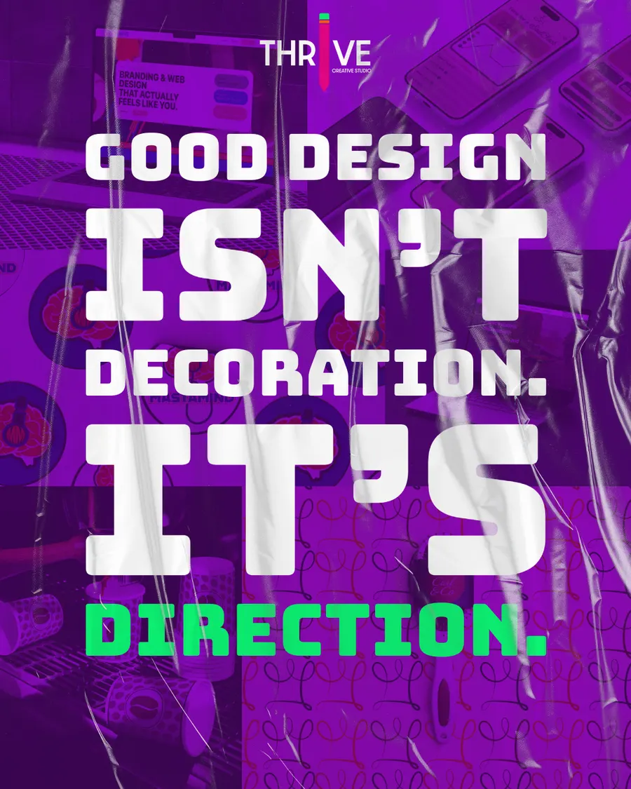
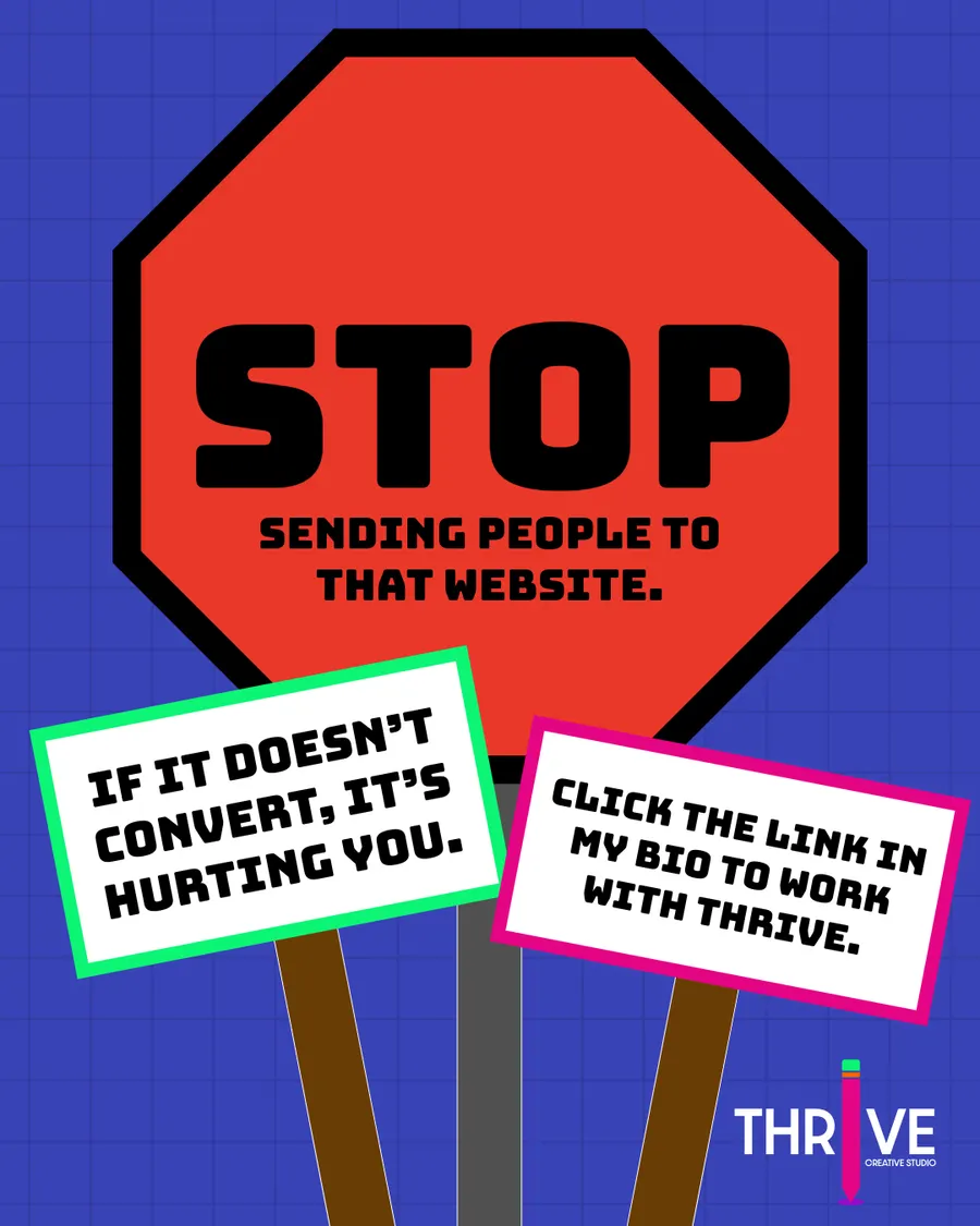
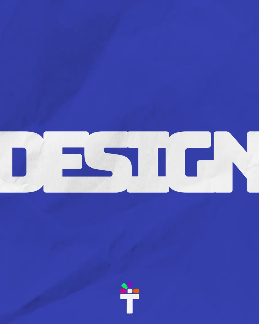
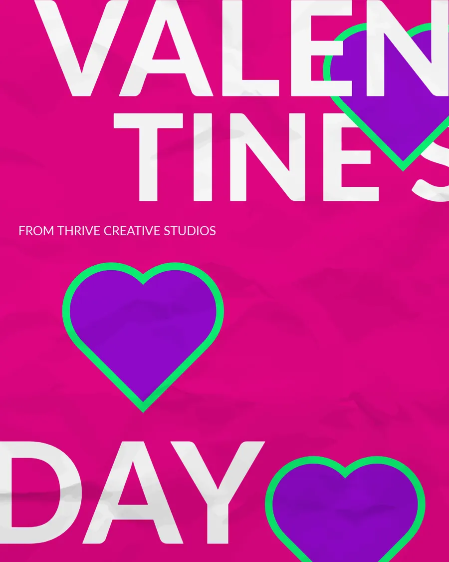
Short, bold statements about what makes design work. Each one carries the Thrive logo and the same palette, so the feed reads as one voice.
Website rebuild carousel
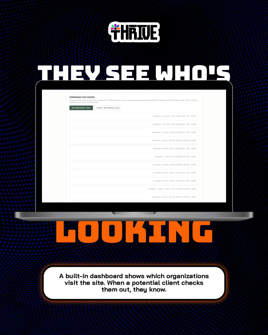
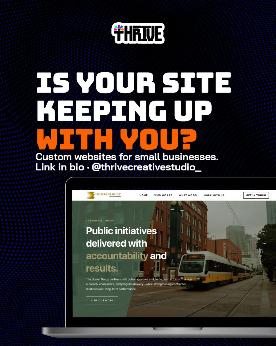
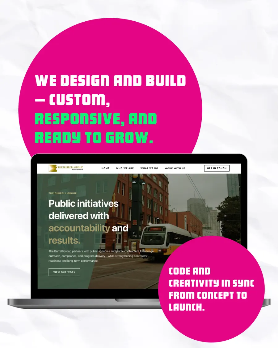
Six slides on Thrive's rebuild of The Burrell Group's website: the template site they started with, the custom site they have now, how staff edit it and who visits.
Client spotlights
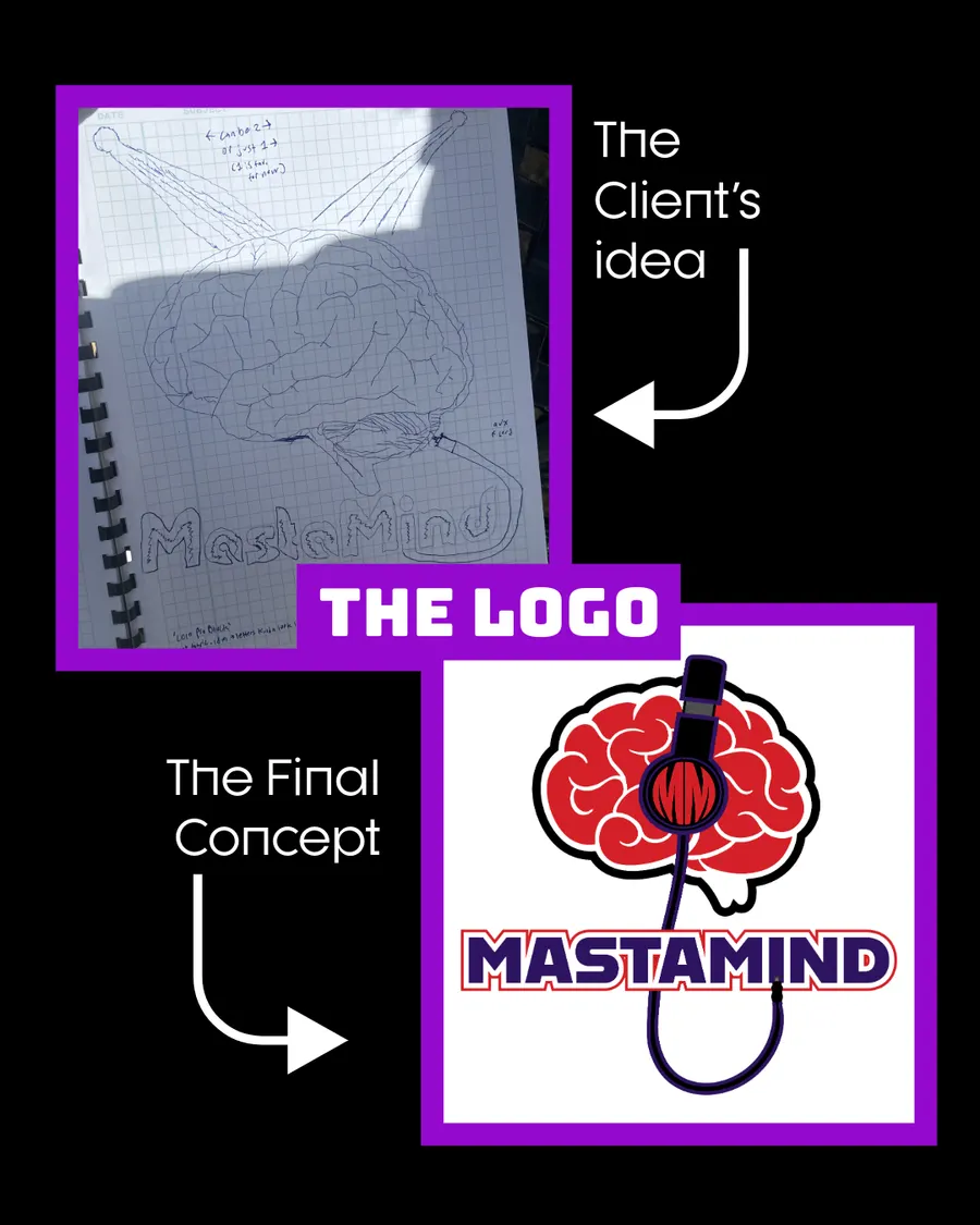
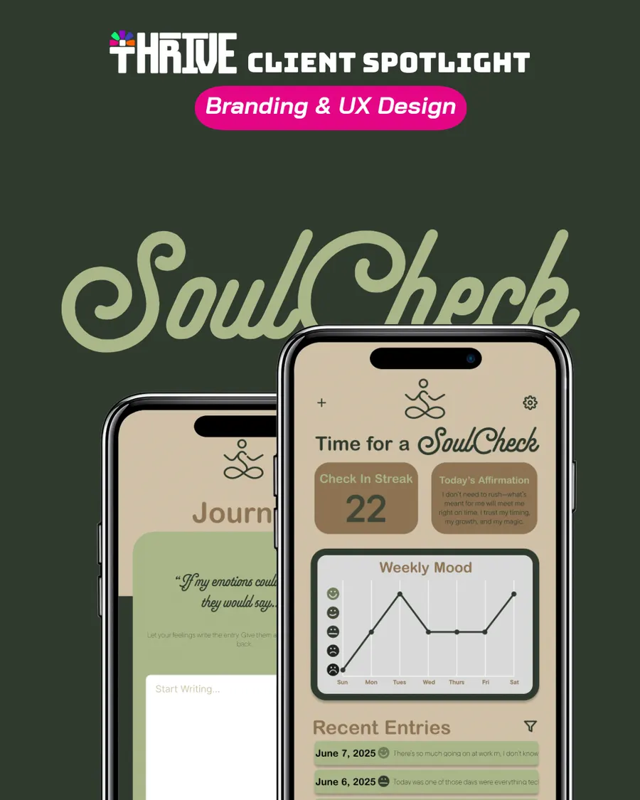
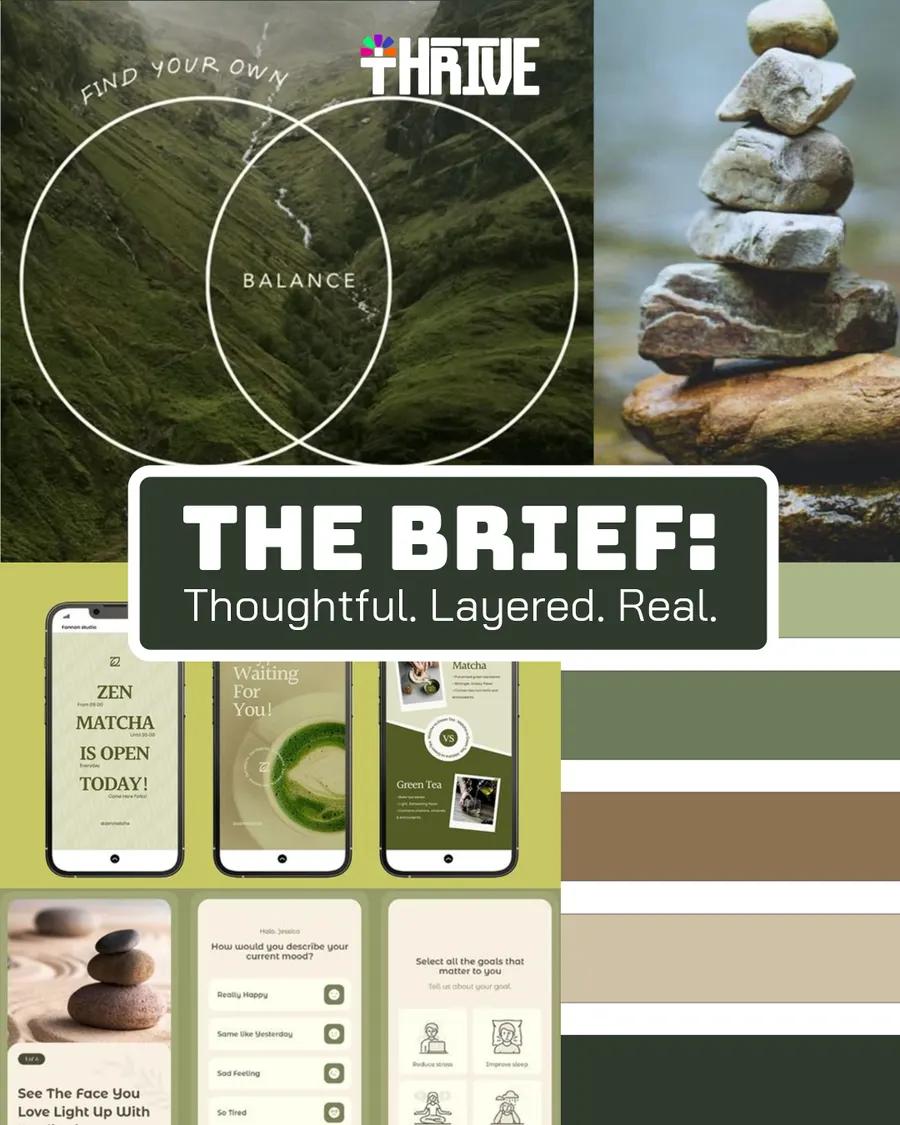
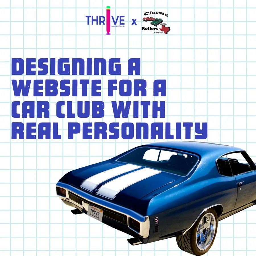
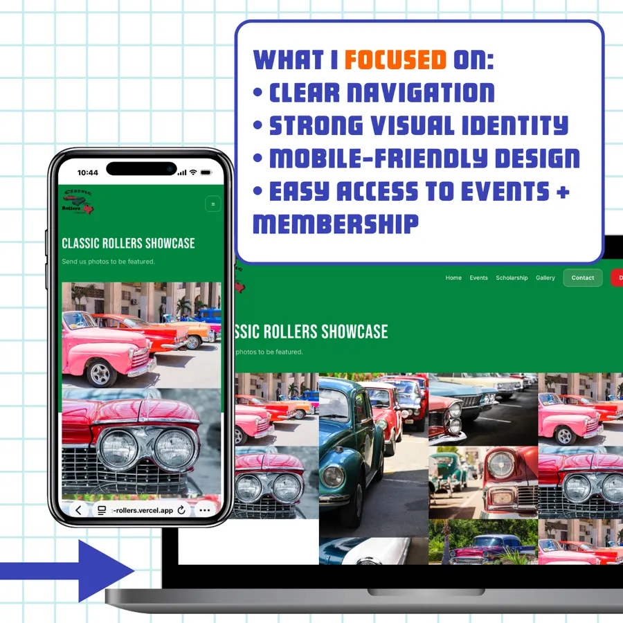
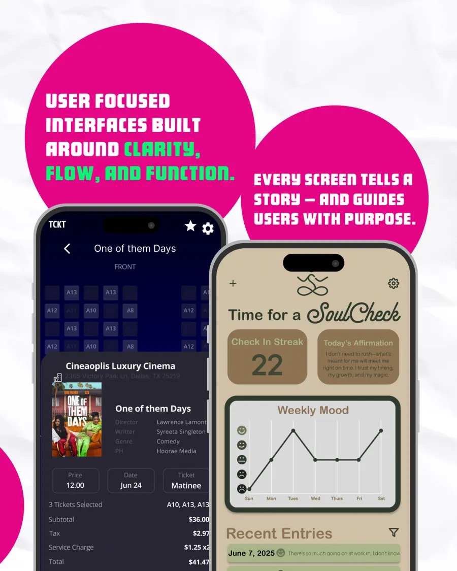
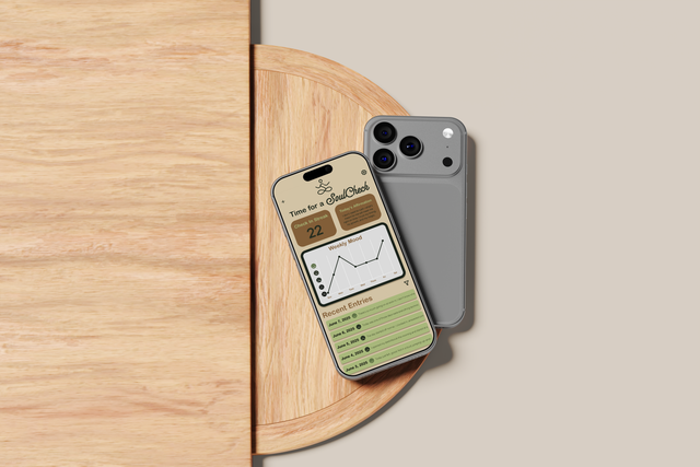
Each spotlight walks through one project, from the client's idea to the finished brand or product: Mastamind's logo, the SoulCheck app and the Classic Rollers car club website.

Introducing the studio
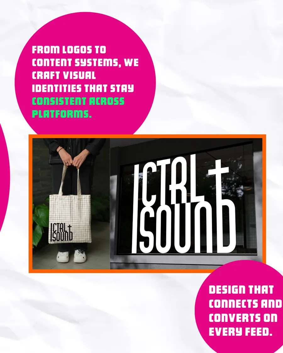
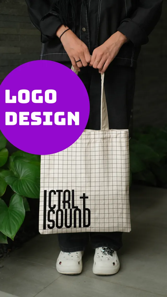
A carousel that explains what Thrive does, one service per slide, using real projects: the Ctrl + Sound logo, the TCKT and SoulCheck apps and The Burrell Group website.
Stories
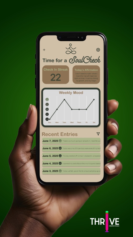
Vertical graphics for quick, everyday posts: a tip, today's creation, a new logo or a nudge to work with Thrive.

Design system
The feed uses Thrive's own brand system: saturated blue, magenta, purple, orange and mint, heavy display type and the pencil “i” in the logo. Bright color and short statements make a post recognizable before anyone reads the name.
#3b43af#d12e83#861dc5#ea6b2c#71f082#000000One idea per post
A single statement, set big, with one or two words picked out in a second color.
Real work as proof
Client sites and apps appear on laptops and phones, so every claim is backed by a project.
Grids and stars
A drafting grid and star shapes tie single posts, carousels and stories together.
A call to action
Posts end by pointing to the link in bio or the website.
The outcome
Thrive's feed now looks like one brand and runs on a plan, not on whenever there's time. Point-of-view posts, client spotlights, case-study carousels and stories each have a set format, so new posts are quicker to make and easy to recognize.
It's also the same system Thrive offers clients: a monthly content structure and branded post and story templates.
More work
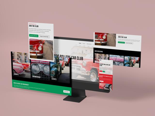 WebsiteClassic Rollers Car Club
 Photography2026 Graduation Pictures
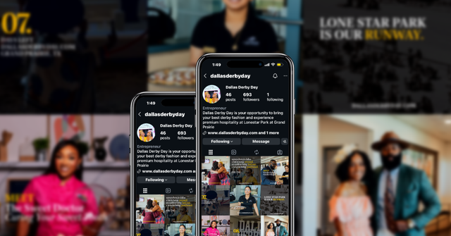 Social MediaDallas Derby Day
 UXSafeSpace
 Digital DesignBrewHaus
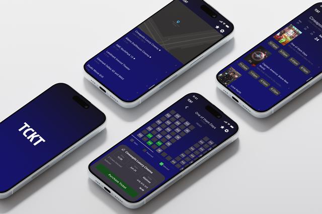 Product UXTCKT
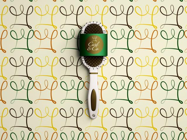 BrandingCurl & Co.
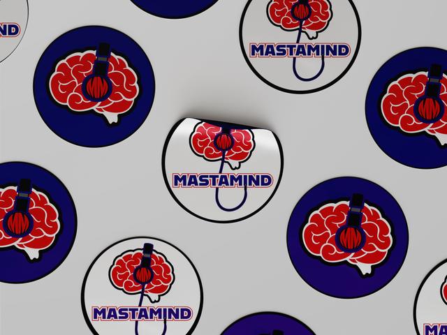 BrandingDJ Mastamind
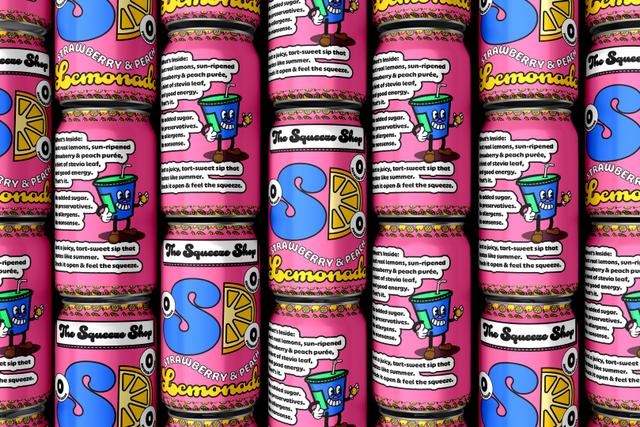 BrandingThe Squeeze Shop
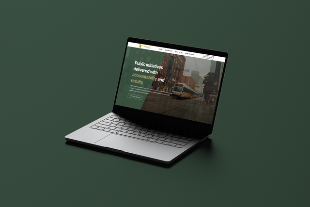 BrandingThe Burrell Group
 UXSoulcheck
 Social MediaRoots to Wellness Social Media Management + Graphics Creation